- Title bar customization
- How much to customize the title bar
- Simple color customization
- Full customization
- Draggable regions
- Default draggable region
- System caption buttons
- Interactive content
- Transparency in caption buttons
- Full screen and tablet mode
- Customizing Title Bar and Status Bar in Universal Windows Platform (UWP)
- Joel Joseph
- Share this post
- Google Authentication in Existing Universal Windows Platform(UWP) App Using Azure Mobile App SDK
- Navigation Between Pages Using MVVM Light in Universal Windows Platform(UWP)
Title bar customization
When your app is running in a desktop window, you can customize the title bars to match the personality of your app. The title bar customization APIs let you specify colors for title bar elements, or extend your app content into the title bar area and take full control of it.
How much to customize the title bar
There are two levels of customization that you can apply to the title bar.
For simple color customization, you can set ApplicationViewTitleBar properties to specify the colors you want to use for title bar elements. In this case, the system retains responsibility for all other aspects of the title bar, such as drawing the app title and defining draggable areas.
Your other option is to hide the default title bar and replace it with your own XAML content. For example, you can place text, buttons, or custom menus in the title bar area. You will also need to use this option to extend an acrylic background into the title bar area.
When you opt for full customization, you are responsible for putting content in the title bar area, and you can define your own draggable region. The system Back, Close, Minimize, and Maximize buttons are still available and handled by the system, but elements like the app title are not. You will need to create those elements yourself as needed by your app.
Simple color customization is available to Windows apps using XAML, DirectX, and HTML. Full customization is available only to Windows apps using XAML.
Simple color customization
If you want only to customize the title bar colors and not do anything too fancy (such as putting tabs in your title bar), you can set the color properties on the ApplicationViewTitleBar for your app window.
This example shows how to get an instance of ApplicationViewTitleBar and set its color properties.
This code can be placed in your app’s OnLaunched method (App.xaml.cs), after the call to Window.Activate, or in your app’s first page.
The Windows Community Toolkit provides extensions that let you set these color properties in XAML. For more info, see the Windows Community Toolkit documentation.
There are a few things to be aware of when setting title bar colors:
- The button background color is not applied to the close button hover and pressed states. The close button always uses the system-defined color for those states.
- The button color properties are applied to the system back button when it’s used. (See Navigation history and backwards navigation.)
- Setting a color property to null resets it to the default system color.
- You can’t set transparent colors. The color’s alpha channel is ignored.
Windows gives a user the option to apply their selected accent color to the title bar. If you set any title bar color, we recommend that you explicitly set all the colors. This ensures that there are no unintended color combinations that occur because of user defined color settings.
Full customization
When you opt-in to full title bar customization, your app’s client area is extended to cover the entire window, including the title bar area. You are responsible for drawing and input-handling for the entire window except the caption buttons, which are overlaid on top of the app’s canvas.
To hide the default title bar and extend your content into the title bar area, set the CoreApplicationViewTitleBar.ExtendViewIntoTitleBar property to true.
This example shows how to get the CoreApplicationViewTitleBar and set the ExtendViewIntoTitleBar property to true. This can be done in your app’s OnLaunched method (App.xaml.cs), or in your app’s first page.
This setting persists when your app is closed and restarted. In Visual Studio, if you set ExtendViewIntoTitleBar to true, and then want to revert to the default, you should explicitly set it to false and run your app to overwrite the persisted setting.
Draggable regions
The draggable region of the title bar defines where the user can click and drag to move the window around (as opposed to simply dragging content within the app’s canvas). You specify the draggable region by calling the Window.SetTitleBar method and passing in a UIElement that defines the draggable region. (The UIElement is often a panel that contains other elements.)
Here’s how to set a Grid of content as the draggable title bar region. This code goes in the XAML and code-behind for your app’s first page. See the Full customization example section for the full code.
By default, some UI elements such as Grid do not participate in hit testing when they don’t have a background set. For the grid AppTitleBar in the sample below to allow dragging, we therefore need to set the background to Transparent .
The UIElement ( AppTitleBar ) is part of the XAML for your app. You can either declare and set the title bar in a root page that doesn’t change, or declare and set a title bar region in each page that your app can navigate to. If you set it in each page, you should make sure the draggable region stays consistent as a user navigates around your app.
You can call SetTitleBar to switch to a new title bar element while your app is running. You can also pass null as the parameter to SetTitleBar to revert to the default dragging behavior. (See «Default draggable region» for more info.)
The draggable region you specify needs to be hit testable, which means, for some elements, you might need to set a transparent background brush. See the remarks on VisualTreeHelper.FindElementsInHostCoordinates for more info.
For example, if you define a Grid as your draggable region, set Background=»Transparent» to make it draggable.
This Grid is not draggable (but visible elements within it are): .
This Grid looks the same, but the whole Grid is draggable: .
Default draggable region
If you don’t specify a draggable region, a rectangle that is the width of the window, the height of the caption buttons, and positioned along the top edge of the window is set as the default draggable region.
If you do define a draggable region, the system shrinks the default draggable region down to a small area the size of a caption button, positioned to the left of the caption buttons (or to the right if the captions buttons are on the left side of the window). This ensures that there is always a consistent area the user can drag.
System caption buttons
The system reserves the upper-left or upper-right corner of the app window for the system caption buttons (Back, Minimize, Maximize, Close). The system retains control of the caption control area to guarantee that minimum functionality is provided for dragging, minimizing, maximizing, and closing the window. The system draws the Close button in the upper-right for left-to-right languages and the upper-left for right-to-left languages.
The dimensions and position of the caption control area is communicated by the CoreApplicationViewTitleBar class so that you can account for it in the layout of your title bar UI. The width of the reserved region on each side is given by the SystemOverlayLeftInset or SystemOverlayRightInset properties, and its height is given by the Height property.
You can draw content underneath the caption control area defined by these properties, such as your app background, but you should not put any UI that you expect the user to be able to interact with. It does not receive any input because input for the caption controls is handled by the system.
You can handle the LayoutMetricsChanged event to respond to changes in the size of the caption buttons. For example, this can happen when the system back button is shown or hidden. Handle this event to verify and update the positioning of UI elements that depend on the title bar’s size.
This example shows how to adjust the layout of your title bar to account for changes like the system back button being shown or hidden. AppTitleBar , LeftPaddingColumn , and RightPaddingColumn are declared in the XAML shown previously.
Interactive content
You can place interactive controls, like buttons, menus, or a search box, in the top part of the app so they appear to be in the title bar. However, there are a few rules you must follow to ensure that your interactive elements receive user input.
- You must call SetTitleBar to define an area as the draggable title bar region. If you don’t, the system sets the default draggable region at the top of the page. The system will then handle all user input to this area, and prevent input from reaching your controls.
- Place your interactive controls over the top of the draggable region defined by the call to SetTitleBar (with a higher z-order). Don’t make your interactive controls children of the UIElement passed to SetTitleBar. After you pass an element to SetTitleBar, the system treats it like the system title bar and handles all pointer input to that element.
Here, the TitleBarButton element has a higher z-order than AppTitleBar , so it receives user input.
Transparency in caption buttons
When you set ExtendViewIntoTitleBar to true, you can make the background of the caption buttons transparent to let your app background show through. You typically set the background to Colors.Transparent for full transparency. For partial transparency, set the alpha channel for the Color you set the property to.
These ApplicationViewTitleBar properties can be transparent:
- ButtonBackgroundColor
- ButtonHoverBackgroundColor
- ButtonPressedBackgroundColor
- ButtonInactiveBackgroundColor
The button background color is not applied to the close button hover and pressed states. The close button always uses the system-defined color for those states.
All other color properties will continue to ignore the alpha channel. If ExtendViewIntoTitleBar is set to false, the alpha channel is always ignored for all ApplicationViewTitleBar color properties.
Full screen and tablet mode
When your app runs in full screen or tablet mode, the system hides the title bar and caption control buttons. However, the user can invoke the title bar to have it shown as an overlay on top of the app’s UI. You can handle the CoreApplicationViewTitleBar.IsVisibleChanged event to be notified when the title bar is hidden or invoked, and show or hide your custom title bar content as needed.
This example shows how to handle IsVisibleChanged to show and hide the AppTitleBar element shown previously.
Customizing Title Bar and Status Bar in Universal Windows Platform (UWP)
This article will help you to customize the Status Bar and Title Bar in a Windows 10 Universal Platform App.
If you have been developing Apps for Windows 10, there are instances where you will need to customize the Title Bar or Status Bar like changing the color or adding back button.let’s see how this can be done.
Gettig Started
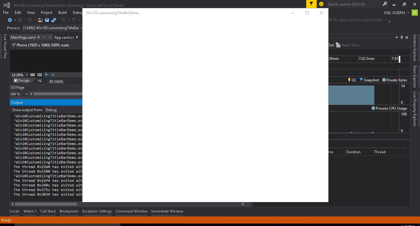
For now let’s hope you have already setup a blank project for Universal Windows Platform . I have named my solution as Win10CustomizingTitleBarDemo .
After the setup i have removed the Frame Counter in the App, not that important i just don’t need it in this scenario. Also there is MainPage.xaml page which is generated with the project Solution.
MainPage.xaml
The XAML code for the page is :
The MainPage.xamal.cs has the following code:
The App.xaml.cs of the app look something like this:
Change Title Bar Color
Want to play around with the Title Bar of your app, you can easily do that. There are set of APIs that can help you to deal with playing around Title Bar. Instead of having default color of title bar, you can apply your own colors. Not only with colors, you can even customize the overall appearance of the Title bar.This is often useful when you want to match a color theme with your overall app along with the title bar.
If you Wish to maintain the color of Title bar through out the app then you can write the following code inside the OnLaunched in the App.xaml.cs or if you wish to change the color for each page then you can write the code inside the Code Behind for example MapinPage.xaml.cs inside the construct after the call to InitializeComponent method.
I chose to maintain the color through out the app so code is placed inside OnLaunced method in the App.xaml.cs:
You also have to add the dependency to App.xaml.cs:
The code for function GetSolidColorBrush
Also you can see that i have used a custom function called GetSolidColorBrush to convert hex to colors. For more details on converting Hex to Color in C# read my other article Converting Hex to Color in C# for Universal Windows Platform
After all the above steps the App.xaml.cs code will have the following code :
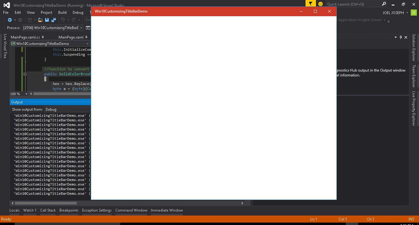
Now if you run the App you can find the color on your Title bar :
In the Windows Mobile the scenario is different you have Status bar instead of the Title bar you will have to use the following code if you want to play with it. Also remember that before to use any specific platform API you need to add a reference to the correspondent Extension. So you will have to add reference to Windows Mobile Extensions for the UWP .
After this just use the following code to customize the status bar:
Enable back button in the app title bar Windows 10 UWP
In Windows 10 UWP the back button is disabled by default. If you need back button in the application title bar you need to enable it.
To enable the back button, first you need to get the current view and enable the back button for this you can use following code:
You will also have to create an event handler to handle the back button click
Add the following method to handle the back button click.
After all the above steps the App.xaml.cs will have the following code :
Now if you run the app you can you can see that the back button appeared in the Title Bar of the App :
Joel Joseph
Read more posts by this author.
Share this post
Google Authentication in Existing Universal Windows Platform(UWP) App Using Azure Mobile App SDK
This article will help you to setup the Google Authentication in a Windows 10 Universal Platform App using Azure…
Navigation Between Pages Using MVVM Light in Universal Windows Platform(UWP)
This article will help you to setup the basic Navigation with MVVM pattern in a Windows 10 Universal Platform…
Joel Joseph © 2021 Proudly published with Ghost


