- WindowsUI View
- Getting Started Tutorials
- Content Containers
- Navigation Bars
- Buttons
- Flyouts
- Search Panel
- WindowsUI View Designer
- Application Hierarchy and Module Navigation
- Buttons
- Button Availability
- Flyout Panel
- On-Form Access
- Panel Owner
- Alignment
- Show and Hide Flyout Panels
- Beak Panels
- Animation
- Button Panel
- WindowsUI Buttons
- Navigation Bar Buttons
- Container Header Buttons
- Flyout Buttons
- Delegate Actions
- Popup Actions
WindowsUI View
WindowsUIView for the DocumentManager component provides expansive opportunities for creating applications that fully match Microsoft Windows Modern UI guidelines.
A typical Windows UI application is a hierarchical application consisting of multiple screens. At runtime, an end-user navigates from one screen to another according to the application hierarchy. Backward navigation is automatically supported, as child screens are aware of their parents.

The WindowsUIView uses the same concept as all the other DocumentManager’s Views — the content is hosted within Documents that can host any form, user control or third-party control. Windows UI View’s documents are represented by objects of the Document class.
Below is the list of features and concepts, provided by the WindowsUIView.
Getting Started Tutorials
Content Containers
A Content Container is an aggregate visual object that displays its children (documents or tiles) in a specific manner. There are a number of Content Containers provided by the WindowsUIView.
- Tile Container — the container capable of displaying static or animated Tiles of multiple sizes.
- Page Group — stores multiple documents, but allows you to view only one of them at a time. The container displays tab headers for each of its child documents. End-users can navigate through documents by clicking these tabs.
- Tabbed Group — advanced version of the Page Group container capable of displaying Tiles instead of standard tabs.
- Slide Group — displays Documents side-by-side in a single row or column and allows users to scroll through the Documents.
- Split Group — displays its all Documents simultaneously, arranging them in a single row or column without a scroll bar.
- Page — a simple container capable of displaying a single Document.
Navigation Bars
Displayed at runtime by right-clicking the free container space. Navigation Bars are two horizontal strips at the top and bottom application edges. These bars display different types of buttons and serve as the replacement for traditional toolbars.

Navigation bar buttons are WindowsUI Buttons, added to the corresponding action collections. You are free to add your own custom actions or hide default ones. It is also possible to completely disable navigation bars or display them in a custom scenario, different from a default right-click.
Buttons
The WindowsUIView supports multiple types of Actions — objects that implement custom functionality within standard View elements (documents, containers, navigation bars and flyouts). Basically, an action represents an advanced button that possesses a certain functionality, and if needed, a verification method that checks whether or not this button should be currently enabled (displayed). There are several types of Actions, grouped by their purpose, parent container type and place to be displayed. This topic describes all available custom actions and demonstrates detailed examples of adding these actions to the desired UI elements.

Flyouts
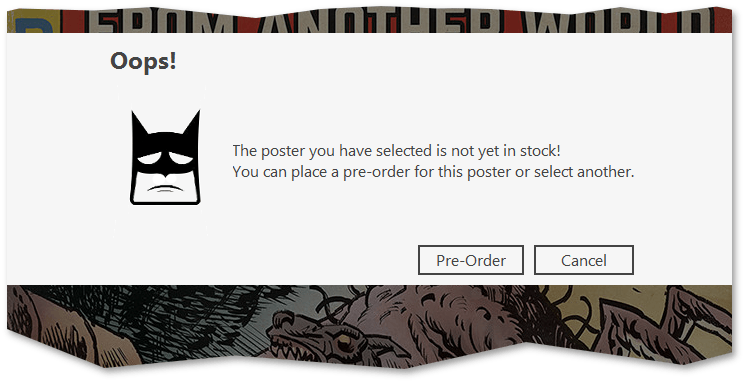
Flyouts emulate message boxes and pop-up windows seen in Microsoft Store applications.

There are three common scenarios for using Flyouts:
- When showing a simple modal message box;
- When showing a pop-up;
- When showing a message box that contains a user control.
Flyout appearance and behavior differs depending on the selected scenario.
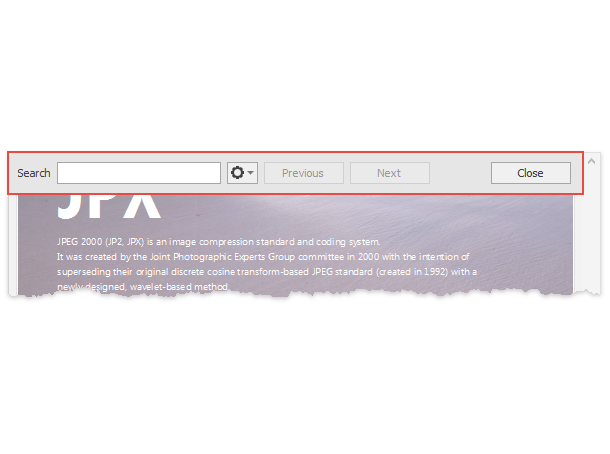
Search Panel
Windows UI View supports the search panel out-of-the-box. The panel allows your end-users to search for the required content throughout content containers and tiles and instantly navigate to it.

By default, the panel is invoked using the Ctrl+F keyboard shortcut. To close the panel, you can click anywhere outside it or press the Esc key. The panel is docked to the right edge of the Windows UI View by default, but you can dock it to the opposite left edge by modifying its AnchorType property.
WindowsUI View Designer
The Windows UI View Designer is the most convenient way to work with this View at design time.

Using this designer, you can do the following:
- Create all types of Windows UI View elements — tiles, documents, content containers and flyouts;
- Modify Views and theirits element properties.
- Drag-and-drop documents and tiles to the desired content containers.
- Preview and modify the current application hierarchy.
- Customize the global View appearance settings, as well as override them for individual containers and documents.
Application Hierarchy and Module Navigation
This article explains how to bind separate application modules together.
Buttons
End-users navigate through wizard windows by clicking navigation buttons. The DevExpress Wizard control provides four embedded navigation buttons — Next, Back, Finish and Cancel. These buttons are located in a separate footer region below the page area (see the figure below).
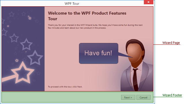
Navigation buttons belong to the wizard footer region, which is separate from pages. However, each individual page provides four boolean Show. properties (e.g., WizardPage.ShowFinish). Using these properties you can display different button sets for different pages. The following mark-up illustrates an example.
Pages of welcome, regular and completion types have their own default button presets. For instance, if a regular page in an XAML sample above had no explicitly specified buttons, it would have displayed a default set of Next, Back and Cancel buttons.
In case your page content already contains buttons that you intend to use for navigation, you can completely hide the entire footer region with its default buttons by setting the WizardPage.ShowFooter property to false.
Button Availability
Wizard navigation buttons support enabled and disabled states. To display a button as disabled, set the related Allow. property to false (e.g., the WizardPage.AllowFinish property for a Finish button). This feature can be used to prompt an end-user to perform a specific action. For instance, the following figure illustrates a regular wizard page that displays long text and a check box. The ‘Next’ button is disabled unless users tick the check box.
In this case, you can bind the WizardPage.AllowNext property to a CanGoNext property from code-behind.
A check box in its turn is bound to the IsAgreed property.
Then, you can easily synchronize these properties, so that the check box will affect the page WizardPage.AllowNext property.
Refer to the MVVM Framework documentation to learn more about property bindings and update notifications.
Flyout Panel
FlyoutPanel is a container that you can show in a position relative to a linked control. The panel can stretch across its parent container, supports animation effects and displays an optional beak element.
Regular Flyout Panel
Beak Flyout Panel
On-Form Access
When you drop a Flyout Panel from the Visual Studio Toolbox onto a form, the panel automatically receives a child FlyoutPanelControl container. Unlike the panel itself, which is borderless, this container has borders painted according to the current application skin. If you need no borders, remove this container and place custom controls directly onto a panel.
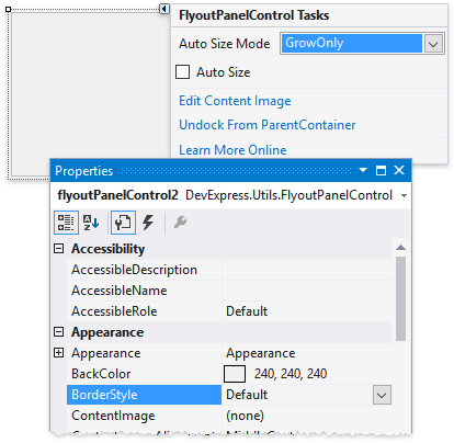
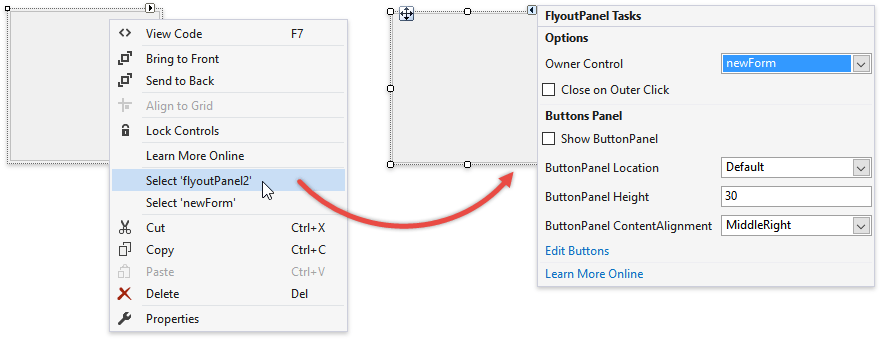
If you have not removed this inner container, you will automatically select it every time you click a panel. To select the FlyoutPanel itself, right-click it and choose «Select ‘ ‘». Then, you will be able to utilize the panel smart tag, which provides quick access to most relevant panel options.
Alternatively, you can press the ESC key.
Panel Owner
A newly added panel reminds you to specify its FlyoutPanel.OwnerControl property.
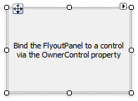
A Flyout Panel must have a parent UI element at all times, since a panel only appears on screen relatively to its parent. Use the panel smart tag to set a parent.
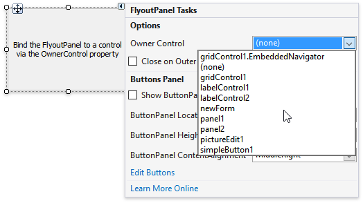
A Flyout Panel must have a form, user control or a regular panel as a parent. Primitive UI elements (buttons, editors, labels, etc.) should be parents of beak panels only.
Alignment
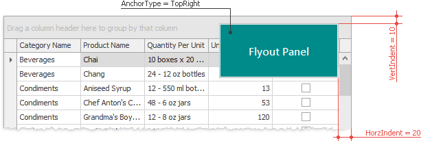
Once you have set a panel parent, use the FlyoutPanelOptions.AnchorType property to set a relative position for the panel. This property is stored within the FlyoutPanel.Options group. With Top, Right, Bottom and Left anchor types a panel will stretch across its parent container.
TopLeft and TopRight anchor types align a panel to the top corners of a parent. In these modes Flyout Panels do not stretch. Additionally, you can shift the panel inwards by setting horizontal and vertical offsets (the FlyoutPanelOptions.HorzIndent and FlyoutPanelOptions.VertIndent properties).
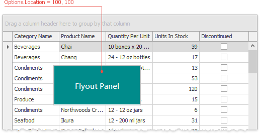
Finally, the Manual anchor type allows you to align a Flyout Panel to any position relative to the owner control’s top left corner. Utilize the FlyoutPanelOptions.Location property to specify panel coordinates in this manual mode.
Show and Hide Flyout Panels
Flyout Panels are initially hidden. To display a panel, call its FlyoutPanel.ShowPopup method. The optional method parameter allows you to skip animation effects and display the panel immediately. If the FlyoutPanelOptions.CloseOnOuterClick property equals true, end-users will be able to hide a panel by clicking anywhere outside it. Otherwise, you will need to call the FlyoutPanel.HidePopup method to close the panel.
Beak Panels
Call the FlyoutPanel.ShowBeakForm method to display a beak panel instead of a regular panel. To hide this panel, utilize the FlyoutPanel.HideBeakForm method.
Beak panels have a few minor differences when compared to standard Flyout Panels.
- Beak panels should accept simple controls (buttons, editors, labels, etc.) as parents (the FlyoutPanel.OwnerControl property).
- Beak panels ignore the FlyoutPanelOptions.AnchorType property and are displayed in a default position (above the related UI element, the beak is at the form’s bottom). The beak form tends to be displayed in its entirety, so the position of the beak and/or the form itself may vary due to insufficient free space. To force the beak form to be displayed at a specific location, use the FlyoutPanel.ShowBeakForm method overloads that take location as a parameter.
- If animation is enabled, it is always the Fade animation, regardless of the FlyoutPanelOptions.AnimationType setting.
Animation
By using the FlyoutPanelOptions.AnimationType property you can select whether Fade or Slide animation effects should follow a panel changing its visibility. To show and hide flyout panels with no animation, call the FlyoutPanel.ShowPopup, FlyoutPanel.ShowBeakForm, FlyoutPanel.HidePopup and FlyoutPanel.HideBeakForm method overloads with the «immediate» parameter set to true.
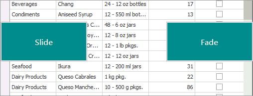
For beak panels the FlyoutPanelOptions.AnimationType property has no effect as they support Fade animation only. Also, it is recommended you utilize Fade animation for regular Flyout Panels with manual alignment.
Button Panel
You can supply a Flyout Panel with push and/or check buttons.
WindowsUI Buttons
The WindowsUI View can display buttons in:
Depending on their type, the WindowsUI View buttons can be divided into:
Navigation Bar Buttons
These are custom buttons within top and bottom Navigation Bars.

The Navigation Bars can display both DelegateAction objects and/or Popup Buttons. These buttons can be of three types, depending on a collection that hosts them.
Global Content Container Actions
These buttons are displayed in Navigation Bars of all Content Containers owned by a View (for instance, the «Exit Application» button). Hosted in the WindowsUIView.ContentContainerActions collection.
Content Container Actions
Navigation Bar buttons shown only for a specific Content Container. Stored within the BaseContentContainer.Actions collection.
Document-Specific Container Actions
These buttons will be available for any Content Container that displays the target Document. Stored within the Document.DocumentContainerActions collection.
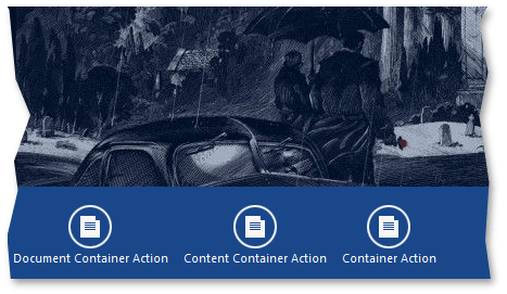
The parent collection of a button affects only the scenario in which this button will be displayed. For end-users, button types from all the three collections make no difference (see the following figure).
To dynamically remove custom and/or default Navigation Bar buttons, handle the WindowsUIView.ContentContainerActionCustomization event. Note that this event is not designated for adding custom buttons to Navigation Bars.
Container Header Buttons
Container header buttons are displayed within the header area of Content Containers.

The only Content Container initially incapable of displaying header buttons is a PageGroup. To enable container header buttons for a PageGroup, set the IPageGroupDefaultProperties.ShowPageHeaders property to DefaultBoolean.False. Note, however, that by doing so, you will also hide all default buttons (buttons for navigating through PageGroup documents and the «Back» button) and will have to add custom buttons as a replacement.
The container header buttons can be divided into two types.
Common Header Buttons
These buttons are owned by the BaseContentContainer.Buttons collection. If you customize this collection at design time, it will be populated with WindowsUIButton objects.
You can customize the shape of these buttons using the BaseContentContainer.ButtonBackgroundImages and IButtonProperties.Glyphs properties.
In code, it is possible to populate this BaseContentContainer.Buttons collection with DelegateAction objects and/or Popup Buttons.
Document-Specific Header Buttons
These buttons are displayed within the header area of any Content Container that displays the target Document. Such buttons must be added dynamically in the WindowsUIView.QueryDocumentActions event.
Alternatively, implement the ISupportDocumentActions interface for UserControls contained within required Documents. See the How To: Create Custom Document Actions example to learn more.
Flyout Buttons
Unlike Navigation Bar/Content Container buttons, which are separate objects of specific classes, Flyout buttons belong to complex FlyoutAction objects. A FlyoutAction carries a text content, an image and a set of buttons. These buttons can be standard FlyoutCommand buttons («OK», «Cancel», «Retry», etc.) or custom buttons. To create a custom button, define a class that derives from the FlyoutCommand class and override its virtual properties.
Refer to the Flyouts topic to learn more.
Delegate Actions
The DevExpress.XtraBars.Docking2010.Views.WindowsUI.DelegateAction class represents simple push buttons. A DelegateAction button has two related methods in code. The first one is a void method that executes required functionality when an end-user clicks this button. The second is a boolean method that checks whether or not required criteria is met. If this boolean method returns false, the DelegateAction button becomes disabled.
DelegateAction buttons provide the following settings.
- Caption — the button text.
- Description — the button tooltip text.
- Type — the button type: navigation or context. Navigation buttons are placed into top Navigation Bars, while context buttons are displayed within bottom bars.
- Edge — he horizontal alignment within Navigation Bars.
- Behavior — additional behavior parameters.
Popup Actions
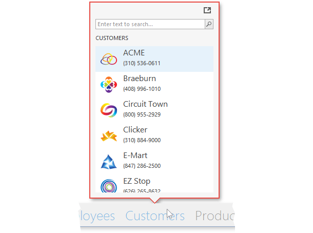
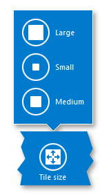
Popup buttons is a Windows 10-styled replacement for the traditional popup menus. For example, if an end-user checks a TileContainer tile, Navigation Bars for this container will display the «Tile Size» popup button.
Popup buttons can be represented by two different classes designed for different types of content..
- Instances of the DelegatePopupMenuAction class — popup buttons that display child buttons (actions) from the Actions collection.
- Instances of the DelegatePopupControlAction class — popup buttons that display any custom controls within their popup panels. These buttons receive their content dynamically in the WindowsUIView.QueryFlyoutActionsControl event.
The code below illustrates how to create buttons of both types: a menu action that hosts three regular actions, and a control action that displays the WindowsUIButtonPanel wrapped in a UserControl. Note that the «Menu Action» popup shows only two buttons because the «_canRemove» condition of the «Remove» button returns false.


