- Best 20 Fonts for Ubuntu
- 1. Source Code Pro
- 2. Hack
- 3. DejaVu Sans Mono
- 4. Fira Code
- 5. Roboto Mono
- 6.Code New Roman
- 7. Bitstream Vera Sans Mono
- 8. Open Sans
- 9. Inconsolata-g
- 10. Acme
- 11. Noto Mono
- 12. Prociono
- 13. Fantasque Sans Mono
- 14. Gugi
- 15. Source Sans Pro
- 16. Do Hyeon
- 17. Gaegu
- 18. PT Sans Narrow
- 19. IBM Plex Mono
- 20. Jua
- About the author
- Swapnil Tirthakar
- How to get gorgeous looking fonts on Ubuntu / Linux Mint
- Fonts on Linux
- Step 1 — Get better fonts
- Step 2 — Tweak your .fonts.conf
- Some background
- Step 3 — Configure font settings
- Configure system fonts — KDE
- Gnome
- Configure web fonts — Chrome/Firefox
- Chrome
- Firefox
- Final Results
- Ubuntu default — Chrome
- Ubuntu TWEAKED — Chrome
- Windows 8 — Chrome
- Monospace
- Droid Mono vs Ubuntu Mono
- What tweaks have been done
- Different fonts for desktop and web
- So do these tweaks matter
- Additional Notes
- References
- 43 thoughts on “ How to get gorgeous looking fonts on Ubuntu / Linux Mint ”
Best 20 Fonts for Ubuntu
New Ubuntu users are generally not familiar with Ubuntu default font family, so today we are going to have a look at best 20 fonts for Ubuntu which can be useful for any Ubuntu user.
Before we get started with the list of fonts I would like to recommend you to install Font Manager which will help you install and delete fonts easily. To install Font Manager on Ubuntu run command given below in Terminal.
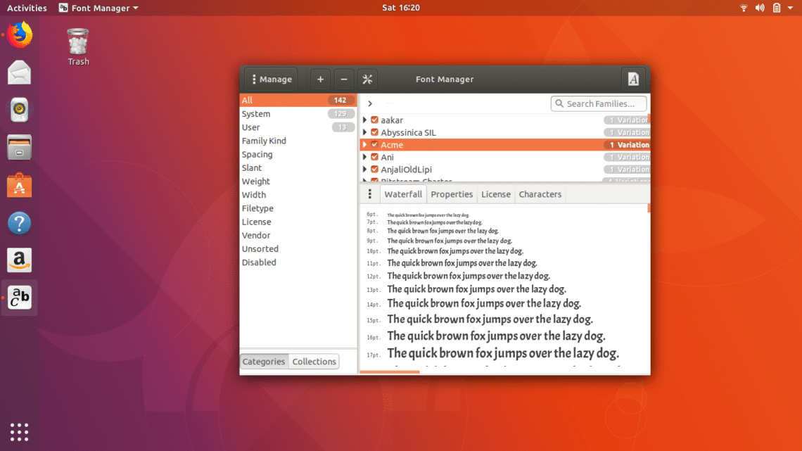
The Font Manager will ease the process of font installation on Ubuntu. Also using this application you can manage all fonts on Ubuntu.
To install following fonts on Ubuntu just download the files from the link provided and extract them using Font Manager. That’s it you are done with font manager. See video below to see how to update fonts in Ubuntu.
1. Source Code Pro
Source Code Pro is an open-source font which was developed for Adobe Systems by Paul D. Hunt. This font can be useful in Terminal Emulator because it features commonly used programming symbols which are easily readable.

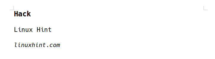
2. Hack
Hack is a free web font which can be used on Ubuntu for various purposes. It is a derivative of Bitstream and DejaVu sets that includes new shapes and adjustments to typeface.
3. DejaVu Sans Mono
DejaVu Sans Mono is a slight design update to Bitstream Vera Forms and with more style options. Its purpose is to provide a wider range of characters while maintaining a original look.

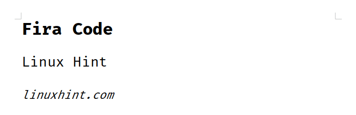
4. Fira Code
Fira Code is Monospaced font with programming ligatures and it is very good font for programming and code reading.
5. Roboto Mono
Roboto Mono is a monospaced font which is optimized for readability on screen across a wide variety of devices and reading environments. This font family is specially designed for reading and the writing application source code.

6.Code New Roman
Code New Roman is another font on our list which can be used in programming languages and it is licensed under the SIL Open Font License which makes it completely free to use personally and professionally. This font looks neat and clean and is comfortable to use for long time on screen.

7. Bitstream Vera Sans Mono
Bitstream Vera Sans Mono is a font family designed by Jim Lyles it is a True Type font with full hinting instructions, which improve its rendering quality on low resolution devices such as computer monitors.

8. Open Sans
Open Sans is a sans serif font family designed by Steve Matteson and belongs to the humanist genre of sans serif typefaces, with a true italic. This font is used in some of Google’s web pages as well its print and web advertisement.

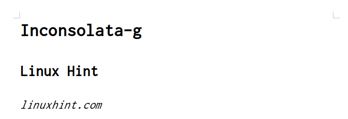
9. Inconsolata-g
Inconsolata-g is an open-source typeface released under the Open Font License of SIL and it is designed by Raph Levien’s. This font is nearly similar to Sans Mono fonts.
10. Acme
Acme is a condensed display typeface designed to be used in headlines, and has a particular and groovy rhythm. This font is carefully designed to work well on all devices.

11. Noto Mono
Noto Mono fonts belongs to the font family comprising over a hundred individual fonts, which are together designed to cover all the scripts encoded in the Unicode standard. It is developed by Google and licensed under SIL Open Font License.

12. Prociono
Prociono is an opentype font designed by Barry Schwartz. The font is designed in such a way that you can use it in headlines for product documentation or for some other work.

13. Fantasque Sans Mono
Fantasque Sans Mono font family is specially designed for programming environment which can be used in Terminal Emulator for developing software.

14. Gugi
Gugi is a Korean and Latin font designed by David Shapira. This font is easily readable on various devices and reading environments. It has neat and clean design so that it can be used for any type of work.

15. Source Sans Pro
Source Sans Pro is first open-source typeface from Adobe family which is created by Paul D. Hunt. It is sans serif typeface and licensed under SIL Open Font license.

16. Do Hyeon
Do Hyeon is open-source Korean and Latin font that brought us nicely crafted fonts like BM Jua and BM Hanna. This font can be used for various purposes personally and professionally.

17. Gaegu
Gaegu is another Korean and Latin font on our list which is highly readable on diffent devices and reading environments. This font is design in such a way that it can be used for any purpose especially for headlines.

18. PT Sans Narrow
PT Sans Narrow was developed for the project “Public Types of Russian Federation” and it is distributed under Libre license. The font family consists of 8 styles: 4 basic styles, 2 captions styles for small sizes and 2 narrows styles for economic type setting.

19. IBM Plex Mono
IBM Plex Mono is an open-source project developed by IBM brand and experience team and created by Mike Abbink. The font family also includes Sans, Sans condensed, Mono and Serif which can be used for various purpose.

20. Jua
Jua is a Korean and Latin font which is stylish font and can be used for headlines and many other purposes. This is retro typeface inspired by brush script.

So, these are the best 20 fonts for Ubuntu as of April 2018. If you have used any of these or any other fonts then share your views for the same @UbuntuHint.
About the author

Swapnil Tirthakar
A Software Engineer who loves football and passionate about traveling. I often spend my free time playing with gadgets and exploring new possibilities in tech world. I am Linux enthusiast and have about 6 years of experience in web development. I have good command on Python, Java, SQL and system security.
Источник
How to get gorgeous looking fonts on Ubuntu / Linux Mint
Fonts on Linux
Fonts on linux have long been an issue due to various reasons like the BCI patent by Apple, lack of free quality fonts etc.
However over time things have changed and now its possible to get your linux system fonts look as good as, or even better than a mac or windows 8 as far as fonts are concerned.
In this post I am going to show you couple of simple tricks that can make the fonts of your linux system look amazing!!
However first there are a couple of things to know about how the tricks work. We are mainly going to do 2 things. First is, get better fonts for the system.
Second, we are going to tweak the «.fonts.conf» file in the home directory. The «.fonts.conf» file allows a user to override the system font settings like antialiasing, hinting, auto-hinting, sub pixel rendering etc.
The tweaks shown in the post should give identical font rendering on any linux distro provided that BCI hinting (Byte code interpreter) is available (which it is on most modern linux distros since the bci patent has now expired).
Step 1 — Get better fonts
Ok, so the first step is to get better fonts for our system. All of these fonts are free and available from the google webfont store at the following url
Here is a list of the fonts you shall need.
Download the font files. Google would give all of them in a single zip file. Make sure you download all styles and all encodings.
Once downloaded, extract them in the following directory.
And they would get installed.
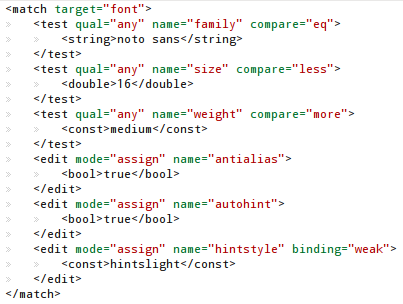
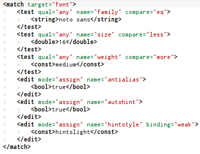
Step 2 — Tweak your .fonts.conf
The next step is to tweak the font rendering through the .fonts.conf file. This file exists in your home directory. In newer versions of ubuntu, if this file is not already there, then create one. The file is in xml format, and through its syntax we can define various settings on per font basis. Like replace a font by another, use autohinting for a certain font, don’t use for another and so on.
So copy the xml from the following url to your .fonts.conf file
If you already have a fonts.conf file then take a backup first. Later if you decide to revert,
Make sure you installed the fonts mentioned in the previous step. After this you need to configure few font settings in kde/gnome, firefox and google chrome. Move on to the next section or continue reading to know more about the fonts.conf tweaks.
Some background
The ubuntu wiki page on fonts has a font configuration xml provided by Obi Bok. It focuses on getting windows xp style clear looking fonts on your linux system with microsoft fonts. For this you need to install the microsoft fonts like Arial, Verdana, Tahoma, Georgia, Times New Roman etc.
On Ubuntu the fonts are available in the repository by the package name ttf-mscorefonts-installer. By installing those fonts, and putting the xml setting in your fonts.conf file your fonts should look like that of windows xp. Infact they would look better than windows XP.
Those microsoft fonts might work well for you, but I think they are out dated and its time to get some modern fonts.
So I modified the original fonts.conf by Obi Bok to suit more to Droid, Noto and Open Sans font families. You will see the results in a short while.
Step 3 — Configure font settings
Now we shall be configuring the desktop (KDE or GNOME) and the web (Firefox or Chrome) to get better font renderings according to our plan.
Configure system fonts — KDE
On KDE, launch System Settings, go to «Common Appearance and Behaviour > Application appearance > Fonts».
Select «Droid Sans» size 9 for all fonts. For «fixed width» font select «Droid Sans Mono» size 9.
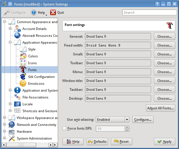
In «Use anti-aliasing» dropdown, select «System Settings». Leave force font dpi unchecked.
On KDE the subpixel rendering cannot be enabled from the .fonts.conf file. Adding the following will have no effect
Hence it has to enabled from the Font settings box.
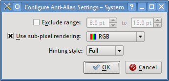
The subpixel rendering setting for kde is stored in the file «
/.kde/share/config/kdeglobals» in a field named «XftSubPixel=rgb».
Thats it. That should make your fonts look better. Try logging out and relogin, if the settings don’t take effect properly.
Gnome
The newer gnome desktops dont have a direct option to change the fonts. Use a tool like gnome-tweak-tool and change the fonts.
Gnome with the default Ubuntu Font at size 11pt.
Gnome with tweaked Droid Fonts at size 10pt.
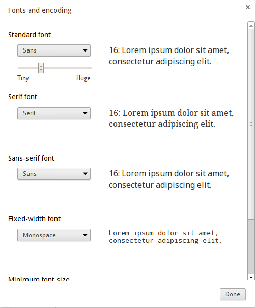
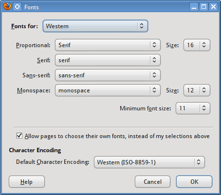
Configure web fonts — Chrome/Firefox
Now open the browsers google chrome and firefox and go to font settings area. And use the following settings
Standard Font — Sans
Serif Font — Serif
Sans-serif font — Sans
Fixed-width font — monospace
Minimum font-size — 11px
Chrome
Firefox
That much is enough for configuring the browsers.
Final Results
The dialog boxes shown above already show the final rendering of the fonts on the desktop. Now I am putting up some screenshots of how the fonts look on webpages.
Here is quick comparison between our font tweaked google chrome on linux and Google chrome with default fonts on windows 8.
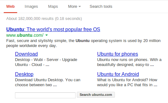
Ubuntu default — Chrome
On a fresh installation of Ubuntu 12.10, google chrome shows google.com like this
Ubuntu TWEAKED — Chrome
Here is the same result with our font tweaks applied. The fonts look rich and well fed.
Windows 8 — Chrome
And for some comparison take a look at how Windows 8 looks
It should be easy to spot out right away how rich the fonts on ubuntu look, when compared to windows 8. I have not checked with mac. May be you should try that and let me know the results.
Monospace
For monospace we have 2 great choices. Droid Sans Mono and Inconsolata. However each has got issues.
1. Droid Sans Mono does not have a Bold version. So making them bold looks ugly on webpages. Inconsolata has got a bold version.
2. Inconsolata is smaller in size than Droid Sans Mono. So at the same size of 9pt or 12px Inconsolata looks much tinier than Droid Sans.
3. Comparatively Droid Mono is clearer than Inconsolata.
Here is a screenshot of how each looks on KDE with full hinting.
Droid Mono at 9pt
Inconsolata at 10pt
So Inconsolata at 10pt looks like Droid Mono at 9pt. Also note that Droid Mono looks nicer than Inconsolata.
Both are at full hinting with autohinting disabled.
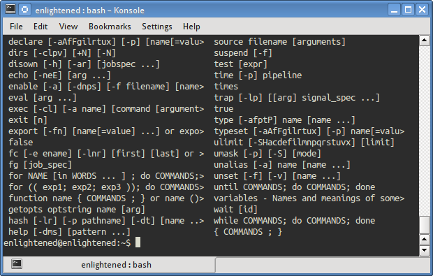
Droid Mono vs Ubuntu Mono
Droid Mono at 9.5pt in Konsole/KDE with full hinting
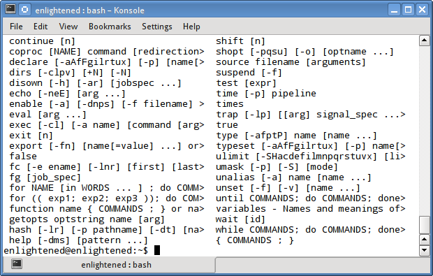
Ubuntu Mono at 11pt in Konsole/KDE with slight hinting
What tweaks have been done
Now I shall explain the tweaks done to your font settings.
1. Arial, Tahoma, Verdana has been replaced by ‘Noto Sans’. This will affect the webpages.
Those 3 fonts are used a lot on websites, because most websites are still living in the old age. So we replace them with Noto Sans, a modern and beautiful looking font from Google.
2. Georgia, Times New Roman replaced by Noto Serif. This will also affect the webpages.
Same reason as before, Noto Serif looks very good.
3. Droid Sans is made the default sans and sans-serif font. This is used on desktop and also on webpages as fallbacks.
4. Droid Serif is made the default serif font.
5. Droid Sans Mono is the default monospace font. This will be seen in the terminals and code editors.
Different fonts for desktop and web
It is important to note that we are using the Droid fonts for the desktop and the Noto fonts for the web (through replacement trick). We could have used the same droid fonts on the web too but it would not work very well for a couple of reasons.
1. To make Droid fonts look the best on the desktop we use bci hinting (by disabling autohinting). Due to this the fonts look very good, but there is a tradeoff. At size 12px ( which is very common on websites ) the font look tiny. Using such a tiny font on a webpage hinders readability.
2. With auto hinter, the size would go up but rendering quality is hampered on the desktop.
3. On web pages Noto Sans with autohinter looks more clear compared to bci hinter, but slightly stretched compared to bci.
So to get the best looks on both the desktop and the web, I came up with the solution of using Droid on the desktop with BCI hinting, and Noto on the web with autohinter.
So do these tweaks matter
The tweaks shown above were tested on LCD monitor at 96 dpi (not sure if that was the actual dpi of the monitor).
On laptops fonts perform better, so even if you were to use a less nicer or a little bad looking font, it would look good on laptops/pads where the pixel density is higher.
Moreover if you are using gnome, then your fonts are by default 11pt which is bigger than the 9pt/10pt examples shown above. At big sizes fonts again perform better. Thats the reason the Ubuntu fonts look good enough on gnome. At smaller sizes the performance or the clarity becomes more testable.
That was the desktop part. On webpages fonts come in various sizes and 12px and 13px are the most common. So this is the place that needs most of the beautification. So even if you are content with the gnome desktop with ubuntu font, the web fonts are surely not very upto the mark, as already shown above.
So try out the tweaks and suggest me further improvements. I hope to continue developing the .fonts.conf file to tweak and tweak more the font settings to achieve don’t know what. Have fun till then!!
Additional Notes
Google Chrome is buggy when it comes to following the rules mentioned in the .fonts.conf file. It does not obey the pixelsize rules. This does not matter unless you want to tweak the fonts.conf file yourself. Firefox follows the rules very well.
In browsers, the fonts.conf hinting rules might not be followed if the actual fonts are not available on the system but present on the webpage through css3. In that case the default hinting rules would be followed.
On chrome, if the fonts are present on the system then fonts.conf rules shall be applied.
On firefox if fonts are loaded via css3 then the fonts.conf rules shall not be applied and default antialiasing will be applied always. However if the same fonts are not loading by css3, then the fonts.conf rules shall be applied.
References
This is a very old and probably the first article that ever came up talking about font issues on linux and how to get windows like fonts on various linux distros.
http://avi.alkalay.net/linux/docs/font-howto/Font.html
This is an excellent article that explains various fonts.conf settings like antialiasing, bci hinting, auto hinting. Its a must read.
https://wiki.archlinux.org/index.php/Font_Configuration
The syntax of the .fonts.conf file is explained here
http://linux.die.net/man/5/fonts-conf
The original xml on which my tweaks are based can be found here
https://wiki.ubuntu.com/Fonts
A Tech Enthusiast, Blogger, Linux Fan and a Software Developer. Writes about Computer hardware, Linux and Open Source software and coding in Python, Php and Javascript. He can be reached at [email protected] .
43 thoughts on “ How to get gorgeous looking fonts on Ubuntu / Linux Mint ”
I’ve taken the time to compile a list of all fonts in a gallery with preview images for all the Ubuntu packages available atm: https://bneijt.nl/pr/ubuntu-fonts/
that looks like a very useful list of fonts for ubuntu users.
Droid Sans Mono looks better than Inconsolata because Inconsolata has a bold font and Droid Sans for some reason doesn’t. Hinting is turned off entirely for bold fonts (meaning bold fonts are rendered like MacOS). Re-enable hinting for bold fonts and inconsolata will look just as clear and bold fonts will be visibly the same point size.
works perfectly on ubuntu 16.04.2
thanks for all the effort
This worked very well for Debian Stretch.
So basically you are ruining the nice, bold anti aliased look that Linux has and trying to Windowsfy the look of the fonts. Looks absolutely terrible.
The fonts.conf file posted in this article made my fonts looks uglier than before in Ubuntu Gnome 16.10, I think it’s not necessary anymore. However, thanks for the article!
This works really well on my ubuntu box running xfce, but on my debian jessei box this seem to fail. Following this guide I took the fonts.conf from the github link and followed the instructions by placing it in my $HOME. All the fonts are also isntalled on the system.. Could you give some pointers or write another howto for debian jessei folks?
i also tried the linux mint version but this did not work unfortunally.
Both Droid and Noto are pretty. But Droid doesn’t display nicely some characters in my language (czech), but Noto does, so I try to force this one instead. Although I get some errors in a console about multiple values in fonts.conf. (Slackware 14.1 64bit)
Does this work on Fedora 21?
Wow this is great. Works on my samsung and vaio laptops. anw, I use kubuntu for both. updated version of xml .fonts.conf will be truly appreciated
Infinality is another way to get the best font rendering on Ubuntu. It also allows to tweak many more options:
http://tuxdiary.com/2014/09/27/font-rendering-ubuntu-infinality/
*”… LCD monitor at 96 dpi (not sure if that was the actual dpi of the monitor) …”*
Perhaps one may also find that it helps to set the correct DPI via xrandr or xorg.conf.
It used to be correctly detected in earlier xorg versions, but it was decided that it should be bug-compatible with Windows (at least pre-7/8), and have a hard-coded default setting of 96dpi, rather than via configuration, regardless of anything.
Depending on your resolution, using the correct DPI may make things have wrong sizes though (or somewhat blurred fonts if the actual DPI is smaller, I guess), that’s because some of the UIs are hard-coded to have pixel-based sizes rather than actual measurements size. Hopefully this will change soon, it seems almost unavoidable with the trend of responsive web design.
Thanks a lot, but I still have difficulties in tweaking font for Chromium browser on Ubuntu 14.04. The browser could not display well, however, Firefox is fine.
I did all these tweaks on ElementaryOS and now my login screen (Pantheon Greeter) has white boxes where characters should be… After login the fonts appear fine, however. Anyone know how I can fix this?
I’m not really sure, but I “often” see white boxes in place of characters that don’t exist on a given font, like Asian characters, if I don’t have the font installed. Perhaps it’s something like that that is happening, somehow.
Thanks for this post! great fonts but I have a problem with chromium; if Im using Open Sans or Noto Sans; the URL bar’s text becomes jumpy; as if It doesnt’ fit, any similar behavior?
I wonder how you did manage to get subpixel font rendering in Plasma applets and panels, In most places (e.g in the panel clocks and in the K-menu I have grayscale rendering despite the system settings and font rendering in applications.
Thanks for the excellent guide. I am happy with is for the most part, with a few very small exceptions. One that irks me a lot is that exclamation marks are nearly undistinguishable from lowercase L’s. Any ideas how to improve that?
Hi Matt, I have the same issue with exclamation marks (mine are looking like a J actually).
Have you managed to solve this?
what about lato pt mono pt sans pt serif on google web fonts
Absolutely awesome, the only thing that didn’t fell good for me on Ubuntu was the lack of good sharp looking fonts on my desktop. This worked like a charm
Thanks, This worked well with slight tweeks for Linux Minut 15 Cinnamon and looks great. I also applied the Firefox settings to Thunderbird and vastly improved readability of email imo.
Cinnamon Fonts — Menu -> System Tools -> System Settings -> Fonts
Default Font – Droid Sans 9
Document Font – Droid Sans 9
Monospace Font – Droid Sans Mono 9
Window Title Font – Droid Sans 9
I was getting a number of errors/warnings in the console when launching binaries in ubuntu 13.04 using the config file linked in the gist above:
Having multiple values in isn’t supported and may not work as expected
I simply (and naively) duplicated the test condition for each of the child entries. This seemed to avoid the error messages and the fonts seems to still render nicely so I don’t _think_ I broke anything. But as mentioned this was a really naive change so your mileage may vary. gist here: https://gist.github.com/allannienhuis/6656339
It’s not better. It’s totally different. See the screenshots on your blog, on the right side “Images” “I” has a serif, the left side is sans serif. Replacing or substituting typefaces is NOT better than correctly rendering, as Infinality does. I recommend Infinality over this method. Much better. Really.
Is there a way to make the typefaces appear more bolder/heavier?
With the latest fontconfig version your fonts.conf file generates lots of warnings: “Having multiple values in isn’t supported and may not work as expected”. I forked your gist to fix them in what seems to be the expected way Thought you might want to have a look and update yours. https://gist.github.com/odony/6173112
Looks like you turned up hinting–or that file you linked to without explaining does–which is only subjectively better. Many people think it makes text look worse (e.g. OS X doesn’t use it). I can’t stand single-pixel-wide fonts, and that’s what hinting forces at smaller sizes. Basically, I think your “before” shots look better than your “after” ones.
Thanks, however, there is one problem I am having: With this .fonts.conf, rendering of most PDF files in Firefox’ / Iceweasel’s internal PDF viewer is very much messed up. For some reason, it displays huge, overlapping letters, making the page completely unreadable. I have already commented out some sections of the .fonts.conf, but so far to no avail. Any hint, which section might be to blame?
the inbuilt pdf viewer of firefox does have its own font rendering issues.
Not sure which fonts.conf setting is messing it up. May be you can try to avoid the replacement of arial by noto sans.
I have tracked the problem down to lines 517-519 of the .fonts.conf. If I comment them out, the viewer works just fine. The lines in question go
So you had to disable autohinting for the font ‘Book Antiqua’
Johannes,
That fix doesn’t work on my install. Note that I’m using Oliver Dony’s forked version of fonts.conf to avoid the “multiple values” warnings. Anyway, if I disable autohinting for Book Antiqua I still have the rendering problems in Firefox. Any other ideas?
Thanks for the suggestion, but I wonder, aren’t most display devices like lcd monitors, laptops and pads using “left-to-right” rgb based pixel display ?
In the last couple of months I’ve replace Droid mono with Inconsolata it’s my new favorite monospace font. I use it in konsole/yakuake, and in all my text editors/IDEs. http://www.google.com/fonts/specimen/Inconsolata
I compared droid mono with inconsolata, and found that droid mono performs better in terms of clarity and nice-ness. However Droid Mono does not have a bold version with inconsolata has. This is a drawback for droid mono when used on webpages, where bold versions look bad with whatever hinting.
Added screenshots of both fonts in the post.
My primary complaint with Droid Mono is that it is relatively difficult to distinguish between “0” and “O”.
Even with standard fonts, my fonts on Linux have looked great for the last few years. I always turn on subpixel rendering and disable all hinting. That’s the closest I can get to OS X’s font rendering. Definitely the Droid fonts look superb. Though I disagree with replacing any and all serif fonts. At decent resolutions Serif fonts are easier to read than sans serif, especially for long blurbs such as news articles or books. There’s a reason Roman fonts have been in use for thousands of years! Perhaps in the future we’ll look back on this time of proliferation of sans serif fonts and see it as a brief period when we had to use sans serif fonts because we didn’t have good enough screens.
We are not replacing serif fonts by sans serif.
Only the Georgia and Times New Roman fonts are replaced by Noto Serif, which is also a serif font that looks much better.
The screen grabs from Ubuntu look great. Are the results equivalent on systems that don’t have Ubuntu’s font rendering patches?
The rendering patches are not specific to ubuntu. Its the bci support in Freetype font engine.
The BCI patents are now expired, so it is available on all major linux distros.
So the results should be identical on all linux systems that have BCI enabled.
Источник


