Quartz фильтры
Чтобы понять, что это такое, прямо сейчас, читая эту статью, нажмите, прямо находясь в браузере, Cmnd-P или выберите из меню File-Print. Разумеется, все это имеет смысл, если вы пользуетесь компьютером Macintosh, в противном случае вам остается только рассматривать иллюстрации.
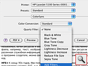
В третьем сверху выпадающем списке выберите ColorSync и нажмите на появившиеся список Quartz Filter, как показано на рисунке. Ну вот, мы, наконец, и добрались до темы нашей статьи. То, что вы видите — это установленные изначально в MacOS X подпрограммы-фильтры для обработки любого, внимание! — ЛЮБОГО документа, из ЛЮБОЙ программы, посылаемого на печать. Причем вспомните, о чем мы говорили в начале, — используя диалог печати, вы всегда можете вместо, собственно, печати, сохранить ваш документ в формате pdf. И, причем, не просто сохранить, а, при желании, применить к документу фильтры обработки. Если вам хотя бы чуть-чуть знаком английский, то названия фильтров говорят сами за себя: преобразование в черно-белое, увеличение и уменьшение яркости, и т.п.
Казалось бы, список не велик, но взгляните на последний пункт выпадающего меню — Add Filter (добавить фильтр). Да-да! Вы можете создавать свои собственные Quartz фильтры, причем для этого не нужно обладать знаниями программиста. Это не для профи — это для всех. Ну что ж, нажмем.
Возможно, после некоторой задержки, если вы экспериментируете, не выходя из браузера, то именно эта страница открылась в совершенно новой программе — ColorSync Utility. Наверное, вы уже догадались, что так документ будет выглядеть при печати. При этом, обратите внимание, система предварительно преобразовала документ в формат pdf, как раз эта работа и потребовала задержки.
ColorSync Utility
Еще раз повторюсь, работая абсолютно в любой совместимой с MacOS X программе, имеющей функцию печати, вы можете применять Quartz фильтры перед печатью или сохранением pdf. А значит, открывать свой документ в ColorSync Utility для наглядного отображения применения или создания новых фильтров. Впрочем, вы можете открывать pdf -файлы, а также графические изображения, во многих популярных форматах, например, в JPEG или TIFF, напрямую в ColorSync Utility. Сама программа находится в папке Utilites в Applications.
Ну вот, восхитившись, невиданными доселе перспективами, которые открывают нам возможности ColorSync Utility, поговорим, собственно, о самих возможностях.
Сначала, следует сказать, что это за программа ColorSync Utility. Дело в том, что это не просто программа для управления и редактирования Quartz фильтров. ColorSync Utility — это видимая часть айсберга, другого важного компонента, неотъемлемой части всей графической системы Max OS X — легендарной системы управления цветом ColorSync.
Почему легендарной? Если вы не слышали это название, значит, вы никогда не сталкивались с работой в полиграфии, где управлением цветом так важно. ColorSync была, наверное, первой профессиональной системой управления цветом, появившейся в мире персональных компьютеров в начале 90х годов, и единственной, встроенной в операционную систему. Во многом именно за это дизайнеры и профессионалы в области полиграфии и цвета так любят Маки, — ведь это единственные компьютеры, где управление цветом пронизывает всю систему от и до, а ColorSync Utility является тем ключом, которым все это управляется.
Возможно, немного странно, что возможности небольшой утилиты по работе с графикой — редактирование фильтров и управление цветом, являются частью одной программы. Но Apple, видимо, решила, что и pdf и ColorSync — неделимые части всей графической системы и управляться все должно при помощи одной утилиты.
Однако, настройка самой ColorSync, работа с цветовыми профилями — тема отдельной и не маленькой статьи, поэтому вернемся к Quartz фильтрам.
Источник
Утилита ColorSync в Mac OS X
Отличительной чертой компьютеров Мас является поддержка графики и издательского дела, благодаря которой эти компьютеры доминируют в полиграфии, а также производстве фотографий и фильмов. Основным вопросом при работе с визуальной средой является гарантия правильной передачи цвета изображения при его пересылке с одного устройства на другое, например, со сканера на компьютер или принтер. Каждое устройство по-своему обрабатывает цвет, поэтому для их сравнения используется профиль цвета, позволяющий правильно настраивать цвет при изменении устройства. Параметры этого отображения можно задать с помощью утилиты ColorSync.

Утилита ColorSync начинает с профиля, присвоенного каждому устройству. Система Mac OS X поставляется с профилями ICC для широко используемых устройств и разными программами для инсталляции устройств и соответствующими профилями ICC. Это значит, что пользователю не придется ничего особенного делать с профилями ICC. Достаточно просто убедиться, что приложения для редактирования и макетирования изображений настроены так, что они понимают, какой профиль к какому изображению следует применить. Список инсталлированных профилей находится на панели Профили.
Однако, если вы хотите уточнить эти цветовые профили, вы можете сделать это с помощью утилиты ColorSync. При этом следует быть осторожным, потому что эти изменения требуют большого опыта, чтобы избежать искажения цветов. Проще всего присвоить разным устройствам разные профили или присвоить профили тем устройствам, которые сами их не инсталлируют. Для присвоения профиля перейдите на панель Устройства, щелкните на треугольной пиктограмме всплывающею меню справа от команды Текущий профиль и выберите команду Другой, чтобы перейти к новому профилю. Кстати, если щелкнуть кнопке Открыть, расположенной справа от названия профиля, то можно увидеть конкретные технические параметры.
Если у вас большой опыт, используйте панель Фильтры, позволяющую настраивать и добавлять параметры цвета для выбранного профиля, и панель Калькулятор для вычисления разных значений цветовых компонентов в разных моделях цвета. Модель цвета описывает физические возможности разных технологий для работы с цветом, например цвет пикселей на мониторе и цвет чернил.
Источник
Modify image colors in ColorSync Utility on Mac
You can use ColorSync Utility to modify an image file by adding effects, changing the color space, resampling the image, or correcting the colors and brightness.
In the ColorSync Utility app  on your Mac, choose File > Open, then select an image file.
When the file opens, click the leftmost pop-up menu at the bottom of the window, then choose an option.
Match to Profile: Changes the colors in an image to match the ColorSync profile. ColorSync Utility modifies the pixels in the image to match the new color model and ColorSync profile, then assigns the new ColorSync profile to it.
Assign Profile: Assigns the ColorSync profile for an image. ColorSync Utility does not modify the image saved in the file; it changes only the ColorSync profile for the image.
Apply Profile: Modifies the pixels in an image to match the new color model and ColorSync profile, then assigns the image’s original ColorSync profile to it.
Click the middle pop-up menu at the bottom of the window, then choose the profile.
Click the rightmost pop-up menu at the bottom of the window, then choose the intent of the color profile.
Automatic: Uses the default intent.
Perceptual: Applies realistic-looking colors, useful for photographs.
Relative Colorimetric: Maintains color accuracy when specific colors are required, for example, in logos.
Saturation: Maintains the vividness of colors, useful for graphics such as pie charts and bar graphs.
Absolute: Adjusts the colors to account for the differences in white points.
Click Apply to save the changes to the file.
To adjust the colors and exposures in an image, click the Image Correction button  in the image’s toolbar. You can improve an image that’s too bright or dark, an image that doesn’t have enough contrast, or an image that needs to be sharper.
Источник
Mac os color sync
Color is a great way to provide status information, give feedback in response to user actions, and help people visualize data.
Use color judiciously for communication. In general, color should be used sparingly, like when you need to call attention to important information. For example, a red triangle that warns people of a critical problem becomes less effective when you use red elsewhere in an app for noncritical reasons.
Consider how your use of color might be perceived in other countries and cultures. In some cultures, for example, red communicates danger, whereas in others it has positive connotations. Make sure the colors in your app send the message you intend.
Avoid using colors that make it hard for people to perceive content in your app. For example, colorblind people might not be able to distinguish some color combinations, and insufficient contrast can cause icons and text to blend with the background and make content hard to read. For guidance, see Color and Contrast.
Consider how nearby artwork and translucency affect colors. Color can lose its impact when composited over a non-neutral or translucent background, or when used adjacent to a very bright, colorful image.
Test your app’s color scheme under a variety of lighting conditions. Lighting varies significantly based on room ambiance, time of day, and more. Colors you see on your computer at design time won’t always look the same when using your app in an environment with bright ambient light conditions. Always preview your app under multiple lighting conditions, including outdoors with a laptop on a sunny day, to see how colors appear. Adjust colors to provide the best possible viewing experience in the majority of use cases.
Use the standard color panel for user color changes. If your app lets people change colors, use the standard color panel (shown below) to obtain the user’s color selection rather than designing a custom color-picker. The standard color panel provides a number of color selection modes, can be expanded with custom color selection modes, and allows the user to save swatches of frequently used colors. For developer guidance, see NSColorPanel. On a Mac equipped with a Touch Bar, you can also let people change colors using the standard color picker.

Color Management
Apply color profiles to your images. Color profiles help ensure that your app’s colors appear as expected on different displays. The Standard RGB (sRGB) color space produces accurate colors on most displays.
Use wide color to enhance the visual experience on compatible displays. Wide color displays support a P3 color space, which can produce richer, more saturated colors than sRGB. As a result, photos and videos that use wide color are more lifelike, and visual data and status indicators that use wide color are more meaningful. When appropriate, use the Display P3 color profile at 16 bits per pixel (per channel) and export images in PNG format. Note that a wide color display is needed to design wide color images and select P3 colors.
Provide color space-specific image and color variations when the experience calls for it. In general, P3 colors and images tend to appear normally on sRGB displays. Occasionally, however, it may be hard to differentiate between two very similar P3 colors when viewed on an sRGB display. Gradients that use colors in the P3 spectrum can also sometimes appear clipped on sRGB displays. To avoid these issues, you can provide distinct images and colors in the asset catalog of your Xcode project to ensure visual fidelity on both wide color and sRGB displays.

Preview your app’s colors on actual sRGB and wide color displays. Make adjustments as needed to ensure an equally great visual experience on both types of displays.
TIP On a Mac with a wide color display, you can use the standard color panel to select and preview P3 colors and compare them with sRGB colors.
System Colors
macOS offers a range of standard system colors that automatically adapt to vibrancy (see Translucency and Vibrancy) and changes in accessibility settings like Increase contrast and Reduce transparency. Use these colors when choosing app tint colors that look great individually and in combination, on both light and dark backgrounds.
Don’t hard code system color values in your app. The color values provided below are intended for reference during your app design process. The actual color values will fluctuate from release to release, based on a variety of environmental variables. Always use the API to apply system colors.
For developer guidance, see NSColor (AppKit) and Color (SwiftUI).
| Aqua | Dark | Name | SwiftUI API |
|---|---|---|---|
| Gray | systemGrayColor |
| Aqua | Dark | Name | SwiftUI API |
|---|---|---|---|
| Gray | systemGrayColor |
| Aqua | Dark | Name | SwiftUI API |
|---|---|---|---|
| Gray | systemGrayColor |
| Aqua | Dark | Name | SwiftUI API |
|---|---|---|---|
Dynamic System ColorsmacOS defines a range of system colors that dynamically match the color scheme of standard interface controls like buttons and labels. These dynamic system colors are listed in the Developer palette of the standard color panel.
Standard color panel (light)
Standard color panel (dark) Don’t redefine the semantic meanings of dynamic system colors. To ensure a consistent experience and ensure your interface looks great when the appearance of macOS changes in the future, use dynamic system colors as intended. Don’t try to replicate dynamic system colors. Dynamic system colors — some of which may be patterns — fluctuate from release to release, based on a variety of environmental variables. Instead of trying to create custom colors that match the dynamic system colors, use the dynamic system colors. Источник |


