- PNG картинки с прозрачным фоном
- Логотип Windows – все версии эмблемы начиная с 1985 года
- Логотип Microsoft Windows в 1985 году
- Логотип Windows 98
- Логотип Windows XP, выпущенный в 2001 году
- Логотип Windows 7, выпущенный в 2009 году
- История логотипа Microsoft
- Содержание
- 1975-1979 — «Джиги-Джиги, Ача-Ача»
- 1980-1981 — «С Диско в Хардкор»
- 1982-1986 — «Зеленый — успокаивает. »
- 1987-2012 — «Waka-Waka-Waka © PAC-MAN»
- 2013 — «Metro Modern»
- Эволюция логотипов Windows
- Microsoft Windows
- Windows 1.0/2.0
- 1985–2001
- Windows 3.0
- 1990–2001
- Windows 3.1x
- 1992–2001
- Windows NT 3.1
- 1993–2001
- Windows NT 3.5x
- 1994–2001
- Windows 95
- 1995–2001
- Windows NT 4.0
- 1996–2004
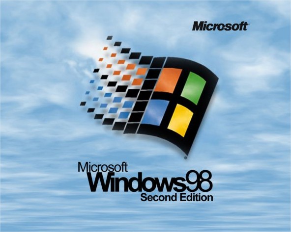
- Windows 98/98 SE
- 1998–2006
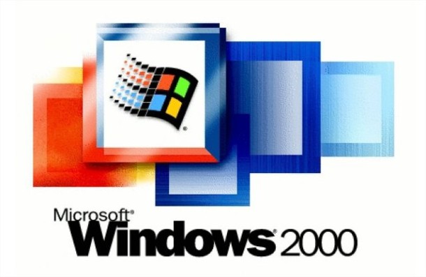
- Windows 2000
- 1999–2010
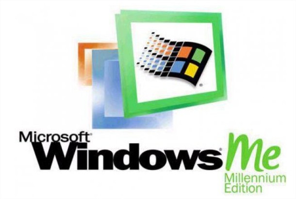
- Windows Millennium Edition
- 2000–2006
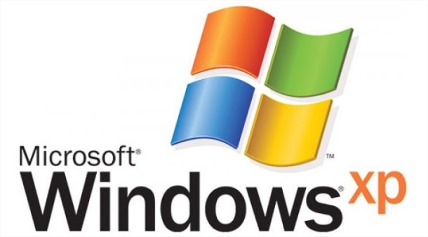
- Windows XP
- 2001–2014
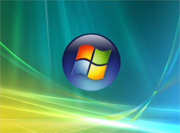
- Windows Vista
- 2006–2017
- Windows 7
- 2009–2020 (Base version), 2009–2023 (Pro and Enterprise versions)
- Windows 8
- 2012–2016
- Windows 8.1
- 2013–present
- Windows 10
- 2015–present
- Windows 10X
- 2020–present
PNG картинки с прозрачным фоном
Windows — семейство проприетарных операционных систем корпорации Microsoft, ориентированных на применение графического интерфейса при управлении. Изначально Windows была всего лишь графической надстройкой для MS-DOS. По состоянию на август 2014 года под управлением операционных систем семейства Windows по данным ресурса Net Applications работает около 89% персональных компьютеров. Windows работает на платформах x86, x86-64, IA-64 и ARM. Существовали также версии для DEC Alpha, MIPS, PowerPC и SPARC.
Первые версии Windows не были полноценными операционными системами, а являлись надстройками к операционной системе DOS и были по сути многофункциональным расширением, добавляя поддержку новых режимов работы процессора, поддержку многозадачности, обеспечивая стандартизацию интерфейсов аппаратного обеспечения и единообразие для пользовательских интерфейсов программ. Предоставляли встроенные средства GDI и USER для создания графического интерфейса. Первые версии Windows вообще состояли из трёх модулей — KERNEL, GDI и USER. Первый из них обеспечивал управление памятью, запуск исполняемых файлов и загрузку динамических библиотек DLL, второй — графику, третий — окна. Они работали с процессорами, начиная с Intel 8086.
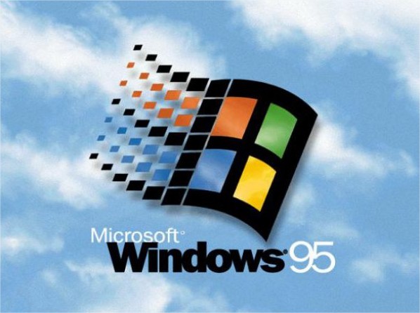
Первая система данного семейства Windows 95 была выпущена в 1995 году. Её отличительными особенностями являлись: новый пользовательский интерфейс, поддержка длинных имён файлов, автоматическое определение и конфигурация периферийных устройств Plug and Play, способность исполнять 32-битные приложения и наличие поддержки TCP/IP прямо в системе. Windows 95 использовала вытесняющую многозадачность и выполняла каждое 32-битное приложение в своём адресном пространстве. К данному семейству относятся также Windows 98 и Windows ME.
Логотип второй системы семейства Windows 9x
Операционные системы этого семейства не являлись безопасными многопользовательскими системами как Windows NT, поскольку из соображений совместимости вся подсистема пользовательского интерфейса и графики оставалась 16-битной и мало отличалась от той, что была в Windows 3.x. Так как этот код не был потокобезопасным, все вызовы в подсистему оборачивались в мьютекс по имени Win16Lock, который, кроме того, ещё и находился всегда в захваченном состоянии во время исполнения 16-битного приложения. Таким образом, «повисание» 16-битного приложения немедленно блокировало всю ОС. Но уже в 1999 году вышло второе исправленное издание.
Программный интерфейс был подмножеством Win32 API, поддерживаемым Windows NT, но имел поддержку юникода в очень ограниченном объёме. Также в нём не было должного обеспечения безопасности (списков доступа к объектам и понятия «администратор»).
В составе Windows 95 присутствовал MS-DOS 7.0, однако его роль сводилась к обеспечению процесса загрузки и исполнению 16-битных DOS приложений. Исследователи заметили, что ядро Windows 95 — VMM — обращается к DOS под собой, но таких обращений довольно мало, главнейшая функция ядра DOS — файловая система FAT — не использовалась. В целом же интерфейс между VMM и нижележащей DOS никогда не публиковался, и DOS была замечена Эндрю Шульманом (книга «Недокументированный Windows 95») в наличии недокументированных вызовов только для поддержки VMM.
В данной галерее можно скачать PNG изображения: Windows логотипы PNG изображения скачать бесплатно, windows лого PNG
Логотип Windows – все версии эмблемы начиная с 1985 года
Благодаря более чем 90 процентам компьютеров в мире, оснащенных версией операционной системой Windows, логотип Windows является одним из самых популярных логотипами в мире.
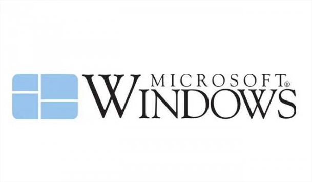
Microsoft начала с мягкой цветной графики, которая содержала отсылку к структурам данных. Они использовали скрещенную букву «W». Этот логотип имел технический, сложный вид.
Логотип Microsoft Windows в 1985 году
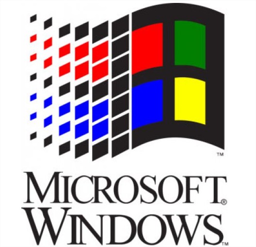
В течение следующих нескольких итераций было добавлено больше цветов: красный, зеленый, синий и желтый. Кроме того, был одобрен более смелый вид.
Логотип Windows 98
Когда Microsoft появилась в новом образе, логотип снова был переработан. Он приобрел более чистый, трехмерный вид. Графика теперь была модернизирована.
Логотип Windows XP, выпущенный в 2001 году
Это изменение придало логотипу «пластичный» вид. В течение следующих двух поколений дизайнеры логотипов перешли на более плоские и более простые изображения. Эти тонкие изменения соответствовали эволюции цифровых экранов. По мере того, как разрешения стали лучше, лого стал тоньше.
Логотип Windows 7, выпущенный в 2009 году
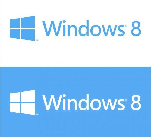
Наконец, настоящий логотип, который был представлен с приходом Windows 8. Это было время, когда вся философия дизайна продуктов Microsoft менялась — когда весь мир дизайна осознал удобство дизайна в стиле минимализм.
Интересно, что логотип Windows 8/10 имеет связь с самым первым вариантом. Изменения, который несет текущий логотип, — это более темные оттенки цветов, чем используемые в оригинальном логотипе 1985 года.
История логотипа Microsoft
Microsoft — компания, которая создала легендарный Windows, популярный XBOX-360 и инновационный XBOX One. Ей уже 38 лет. И за эти годы она несколько раз меняла логотипы. Один логотип даже похож на «лого» группы Metallica. Давайте узнаем, какие же логотипы были у Microsoft.
Содержание
Как я уже сказал, Microsoft уже 38 лет. И за эти 38 лет она 5 раз сменила логотип. Для начала просмотрим все 5 логотипов:
К каждому «лого» Microsoft подходила ответственно. Давайте узнаем о каждом логотипе побольше.
1975-1979 — «Джиги-Джиги, Ача-Ача»
Не знаю почему, но первая ассоциация с логотипом была песня из какого-то знакомого мне Индийского фильма. Видимо и сотрудники под эту песню делали логотип.
Сам он похож на Диско-Style, ну середина 70-х годов, что сказать теперь. В это время штаб Microsoft’a был Альбукерке.
1980-1981 — «С Диско в Хардкор»
Начало восьмидесятых. Microsoft переезжает из Альбукерка а Северо-Запад Вашингтона. А тем временем, начинается жизнь рок-группы Metallica. Если сравнивать с «лого» Металлики, то можно увидеть некое сходство.
Кто у кого украл дизайн, не поймешь. Но логотип «МелкоМягким» быстро надоел.
1982-1986 — «Зеленый — успокаивает. »
Сотрудникам Microsoft’a уже надоело танцевать и петь под Хардкорную музыку. Они быстро придумали новый логотип.
Теперь Microsoft зеленый, в шрифте «Blibbet» и с необычной буквой «О».
И в это же время появились IBM-PC, на 16-рязрядной версии MS-DOS Microsoft.
1987-2012 — «Waka-Waka-Waka © PAC-MAN»
Этот логотип прожил целых 25 лет, а его создатель — Графический Дизайнер Скотт Бейкер [Skott Baker].
Сам логотип называется «PAC-MAN Logo» в связи с тем, что буква О похожа на героя популярной игры. Долго Microsoft дала жить этому логотипу.
У него были разные лозунги, вроде: «Куда вы хотите пойти сегодня?» или же «Ваши способности, наше вдохновение. » ну или последнее «Будь что будет дальше».
2013 — «Metro Modern»
Новый логотип, новая операционная система, новый дизайн. Microsoft старается стать более современной и успешной. Но почему плоские плитки? Что оно обозначает?
1. Логотип обозначает разновидность продуктов.
2. Логотип обозначает операционную систему Windows.
3. Логотип обозначает новый дизайн Metro — плоские плитки.
Но критики были недовольны дизайном. Приведу один пример из сайта CNET:
«Вы всегда замечаете изменение прически вашей возлюбленной. Но вы не только замечаете, но еще и комментируете: «Ты что-то сделала с волосами, да?».Реакция должна быть такой же, когда компания меняет свой логотип: «О, ты стал выглядеть моложе и более привлекательно!».
И все же, когда Microsoft представила новый логотип, меня не покидало ощущение, что компания направлялась в парикмахерскую, но потом передумала и просто причесалась.
Да, конечно, наконец-то отход от жирного курсива, который как будто наклонялся к тебе и говорил: «Ты купишь мой товар, нравится тебе это или нет».Да, новый логотип предполагает, что компания хочет показаться более гуманной, современной, приветливой. И это заметно.
Но мое впечатление – слишком, слишком холодно для дизайна, который стал первым за 25 лет.
Для того, чтобы подтвердить или опровергнуть свои слова, я связался с одной женщиной. Она не имеет никакого отношения к Apple или Microsoft. Но она дизайнер, который лучше понимает чувства логотипа.
«К сожалению, этот логотип скучный. Но это связано с тем, что бренд позволял себе «скучать» так долго. Возникает такое ощущение, что они хотят отразить, что все силы собраны воедино. И пытаются выглядеть, будто это не трудно делать – изменить логотип впервые за 25 лет. Я знаю, что данные принципы они взяли из своих продуктов, но, давайте, встряхнитесь, вы же не Apple, не так ли?».
Не знаю как вы, но я соглашусь с этим комментарием.
Microsoft — действительно, создает очень хорошие продукты, пусть также продолжает 🙂
Эволюция логотипов Windows
Перед выходом новой операционной системы Windows 8 компания Microsoft решила сделать небольшую революцию в своей истории логотипов. Новый логотип самой популярной ОС в мире одноцветный и максимально простой. Этим логотипом компания Microsoft хочет показать изменения, которые произошли в дизайне операционной системе и его новую плиточную архитектуру. Но немногие знают, что этот логотип очень похож на тот, который уже был у Windows несколько лет назад – у версии Windows 1.0.
Логотип операционной системы Windows 1.0 был крайне прост и лаконичен. Он выполнен без лишних «наворотов» и эффектов. Двухцветный логотип лучше всего отражает концепцию первой ОС Windows, очень похожей на MS-DOS.
Вместе с революцией, которая была совершена в мире операционных систем, произошла революция и в логотипах – теперь он стал цветной и предстал в виде флага. Этот флаг с разноцветными окнами станет брендом ОС Windows и основой для последующих логотипов на десятилетия вперед.
Начиная с Windows 95, знаменитый флаг практически не менял своего внешнего вида, а лишь изменял оформление В 95-й и 98-й системах Windows логотип был на фоне голубого неба.
В неудачных версиях Windows — Millennium Edition и Windows 2000 все тот же флаг с окнами уже сам располагался в цветном окне.


Операционная система Windows XP значительно отличалась от своих предшественников, стал отличаться и логотип. Новое лого стало более утонченным и получило объемные спецэффекты.
Операционная система Windows Vista была не столь удачной, как Windows XP, но получила оригинальный логотип, который означал новый дизайн в стиле Aero, он же стал заменой кнопке «Пуск».
Седьмая версия ОС Windows имела тот же логотип, но при запуске он светился.
Логотип Windows 8 значительно изменится по сравнению с предыдущими версиями ОС. Теперь это голубая надпись и такого же цвета плитки в стиле Metro.
Microsoft Windows
This page is about Microsoft Windows, the desktop-oriented operating system for computers. For other Microsoft Windows branded products and brands, see Microsoft Windows (disambiguation).
For other related logos and images, see:
|
|
Microsoft overhauled their logo again to fit in with the new Metro design language on Windows 8, which removes the green, yellow, and red colors to become all blue and a slightly modified Segoe font. This logo was unveiled on Windows 8 Consumer Preview released February 2012. Notable changes is that they Ditched the 3D, Aero And Flag Design And replaced it with a Window And a Flat Design, with perspective, design by Pentagram. Windows 8 was released on October 26, 2012.
Windows 8’s most notable new features are New Metro design, Touchscreen for the new tablet called «Surface», new full Start Menu (Start Screen), Apps, and instead of using the 3D task switcher, it used 2D at the right side of the screen. The original version is known to be the very shortest support version, but counting Windows 8.1 instead of this, Windows 95 and ME had the shortest support versions, due to their negative feedback and lack of usage because of some users staying on the previous version or upgrading as soon as the next version of Windows appeared.
Support ended on January 12, 2016. To regain support, users are recommended to upgrade to Windows 8.1 (which can be done in this version without install disc).
Windows 8.1
2013–present
After a year, Microsoft released Windows 8.1 in October 2013. This logo has an additional «.1» at the end and is also slightly less bold, giving a smoother feel. This logo was not officially used by Microsoft neither in advertising (where the default Windows logo was used) nor in the OS (where the Windows 8 logo was used), but it was used in some conferences.
Windows 8.1 was an update for Windows 8 with some improvements, Start button was reintroduced and some enhances to the Start Screen. Windows 8 and 8.1 were not commonly seen being used among Windows users, mainly due to the removed Start menu.
Mainstream support ended on January 9, 2018, and extended support will end on January 10, 2023.
Windows 10
2015–present
Microsoft officially unveiled the first beta version of Windows 10 on September 30, 2014. The text on the wordmark of the logo was unbolded and the logo itself was made a darker shade of blue. The last version of the operating system was released worldwide on July 29, 2015. Since then, Windows 10 releases new features update twice per year (except in 2016).
Windows 10’s new features are the ability to run Microsoft Store apps on the desktop, return of Start menu although Start screen mode option still remains, new versions of Microsoft Store-based apps, multiple desktops, a voice assistant: Cortana, and a new internet browser: Microsoft Edge. New updates for Windows 10 include Game Mode, Paint 3D and a new interface: Fluent Design which replacing Metro.
This might be the final version of Windows, because Microsoft says it is becoming ‘a service’.
For 2015 LTSB, Mainstream support ended on October 13, 2020, and extended support will end on October 14, 2025.
For 2016 LTSB, Mainstream support will end on October 12, 2021, and extended support will end on October 13, 2026.
For 2019 LTSC, Mainstream support will end on January 9, 2024, and extended support will end on January 9, 2029.
Windows 10X
2020–present
This logo is more rounded off, and has multiple colors, to fit with the new design. Microsoft is making a new version of Windows, aimed at dual-screen tablets. The development started around 2020. This version can run on laptops. As of now, the OS is still not released. But you can run the OS with the Microsoft Device Emulator Software. This version of Windows could run on ARM (Tablet) — based devices. You cannot install the OS onto regular PC’s. It either comes pre-installed, or you’ll need to flash it with NTFS-Pools. It also has a new start menu, taskbar, UI, and system. This OS will not replace Windows 10. This is another OS made for other devices.


