Microsoft shows what Windows 10 will look like down the road
By Paul Lilly 09 February 2017
First look at ‘Project Neon’.
Visual changes are coming to Windows 10. Looking past the upcoming Creators Update, Microsoft is working on an updated design language that it internally calls Project Neon. We’ve heard about this before, though it hadn’t been officially recognized by Microsoft until now.
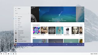
Microsoft gave developers a first look at Project Neon during a keynote at its Windows Developers Day event. There was some large text piled on top that obstructed the screenshot, though PCWorld discovered a clean view by Twitter user Tom Hounsell. That image is shown above.
According to Windows Central, Microsoft’s goal with Project Neon is to «add fluidity, animation, and blur to apps and the operating system.» It’s a visual overhaul that will affect a range of Windows 10 devices, everything from desktops and laptops to HoloLens, Windows 10 Mobile, and Xbox. Microsoft has even begun providing Project Neon APIs in its Windows 10 Preview builds so that developers can start utilizing the new UI and design language.
While official information is rather scarce, it appears that Project Neon is an attempt to beautify Windows 10. MSPowerUser leaked a handful of additional screenshots a month ago and said at the time that Project Neon isn’t a major or complete overhaul of Windows 10’s design language. Instead, it’s a «minor update» that Microsoft is building on top of the current Windows 10 UI.
In the screenshot above, there is an open Groove Music window without a dedicated title bar. The options to close it out, minimize, and maximize the window can be found in the upper-right corner.
Also visible is a more streamlined taskbar. It’s not a lot to look at and of course elements such as animation and blur effects can’t been accurately portrayed in a still shot, but it’s a glimpse nonetheless.
Microsoft has to be careful with tweaking the look of Windows 10 so that it doesn’t alienate users and push them back to Windows 7. Windows 10 has seen steady growth and has proven popular among gamers—around half of all Steam users run Windows 10—but if the changes are too jarring, users might seek out greener pastures wherever they can find them.
Paul has been playing PC games and raking his knuckles on computer hardware since the Commodore 64. He does not have any tattoos, but thinks it would be cool to get one that reads LOAD»*»,8,1. In his off time, he rides motorcycles and wrestles alligators (only one of those is true).
Things I don’t like about Windows 10 a.k.a (Why Windows 10 is ugly ?)
UI-wise this version is really ugly, flat and meant for phone/tablet or some other touch screen device users..
It’s little bit faster than Windows 8.1, but Windows 10 lags first 2 mins on startup and it’s impossible to click anything on the taskbar at that time.
Here is my list of the things I hate about Windows 10:
- Drop down list is out of the window.
- Why title bars are so big now (also minimize/maximize/close section) ?
- Can’t view any update details, can’t hide updates, can’t copy details or stop some particular update
- I can’t choose power plans now ? This was probably one of the most used feature on my PC.. I used it for CPU control and if it heats too much balanced power saver
- This is small thing, but previously there was 15 min option, it would be great if I could enter my own number instead of choosing something.
- Why’s there so big padding between everything and font size ? Is this OS for old people, or for people with big fingers ?
- Also why is the sidebar so wide if text is not even close to the right border ?
- On win8 I could see all details about programs, now on win10 I can’t
- http://geeksontime.com/sites/default/files/field/image/Uninstall%20a%20program%20in%20windows%208.png
- Waste of space. there could have been a lot more things in one window, like it was on win8, on win10 I have to scroll to find something, it’s not easy reachable. Is there a way to reduce spaces in registry somehow ?
- Jump lists. again — huge paddings everywhere.
- If this new Windows is so advanced and etc.. Then why can’t I find anything in the start menu ? I pressed letter «P» for paint and it doesn’t do anything, it wasn’t even there, I had to use Win+R mspaint, this new start menu doesn’t even have «Run» button. (Now I’m using Classic Start Menu, and I can access things a lot faster — services, firewall advanced config, device manager, etc) I was using it since Windows 8, so I didn’t saw anything that happened in the Start Screen, I opened it only maybe like 20-30 times since September 2014.
- I miss Windows 8.1 taskbar and icons. Icon boxes had style, now it’s just plain and flat, and I could change color of taskbar, I know I can do it now, but there’s only limited color choices and it doesn’t look as good as on Windows 8.1
- Themes are useless now, only thing they change is 1px border color
This will probably be updated.
I hope some of the things will be fixed and included in the next patches/updates/service packs. Seriously, this looks like an unfinished version or some test OS which is missing lot’s of UI fixes. BTW looks like Windows 10 was designed by the same designers that did Skype, it’s noticeable because of those huge white spaces.
Here is some comparison:
Was this discussion helpful?
Sorry this didn’t help.
Great! Thanks for your feedback.
How satisfied are you with this discussion?
Thanks for your feedback, it helps us improve the site.
How satisfied are you with this discussion?
Thanks for your feedback.
Replies (12)
* Please try a lower page number.
* Please enter only numbers.
* Please try a lower page number.
* Please enter only numbers.
Geeee I am here for the same reason.
I just don’t understand it at all. Not only I am disappointed. I am depressed with this grey look everywhere. After 25 years I have windows based on colours of inactive windows 😉
Already I have trauma of switching office 2007 to 365, now I have whole environment this way. AND I am not considering myself to have shiny stuff. Minimalistic windows 8 is enough nice for me. Just the colours.
As for the size — be aware that it is all designed probably for tablet use.
I just suppose that:
— MS has too colourful offices and grey let them perform better
— MS works on UHD displays, 10″ tablets and 30″ touch screens
Do not expect them to know consumers 😉
8 people found this reply helpful
Was this reply helpful?
Sorry this didn’t help.
Great! Thanks for your feedback.
How satisfied are you with this reply?
Thanks for your feedback, it helps us improve the site.
How satisfied are you with this reply?
Thanks for your feedback.
I totally agree . I installed Windows 10 before the official launch on a spare PC and uninstalled it within 2 hours.
The atrocious UI is a deal breaker and that’s why I, among many I bet, will be sticking with Windows 7 until Hell freezes over if need be.
ALL traces of that UGLY Flat Fisher-Price UI needs to be removed, I use a DESKTOP with a color monitor not an under powered tablet. If I wanted a UI with such a primitive look I would reinstall Windows 3.1 (which came out in 1992).
Whoever came up with this eyesore should be fired on the spot.
18 people found this reply helpful
Was this reply helpful?
Sorry this didn’t help.
Great! Thanks for your feedback.
How satisfied are you with this reply?
Thanks for your feedback, it helps us improve the site.
How satisfied are you with this reply?
Thanks for your feedback.
3 people found this reply helpful
Was this reply helpful?
Sorry this didn’t help.
Great! Thanks for your feedback.
How satisfied are you with this reply?
Thanks for your feedback, it helps us improve the site.
How satisfied are you with this reply?
Thanks for your feedback.
Yep. Windows new «minimalist» UI. BS minimalist means that we get a hideous monochrome UI. Also what is with all this white background with grey text. There should be some choice of color in the work environment. It doesn’t help that they took Control Panel, and split functions between it and Settings. Awful all the way around. BTW the Insider Preview builds look the same as the End User version, ugly, clunky, and invasive.
Windows 10. An exercise in masochism.
7 people found this reply helpful
Was this reply helpful?
Sorry this didn’t help.
Great! Thanks for your feedback.
How satisfied are you with this reply?
Thanks for your feedback, it helps us improve the site.
How satisfied are you with this reply?
Thanks for your feedback.
7 people found this reply helpful
Was this reply helpful?
Sorry this didn’t help.
Great! Thanks for your feedback.
How satisfied are you with this reply?
Thanks for your feedback, it helps us improve the site.
How satisfied are you with this reply?
Thanks for your feedback.
The thing of it is, that this is a big f<>king joke for The development team, their management, and especially Tony Prophet (Director of Marketing for Windows 10, and general harbinger of disaster).
Black Hat hacker for the common good
Microsoft. Have you taken your Soma today?
1 person found this reply helpful
Was this reply helpful?
Sorry this didn’t help.
Great! Thanks for your feedback.
How satisfied are you with this reply?
Thanks for your feedback, it helps us improve the site.
How satisfied are you with this reply?
Thanks for your feedback.
Windows 10 is terribly ugly. It seems MS asked some summer trainee CS graduates to build this new OS. All of the GUI seems to be developed by 2nd year computer-science graduate, willing to show off his skills to his professor to gain good marks. But alas. even that professor isn’t pacified with this ultra ugly look. He might have said «Hey, why didn’t you use standard Windows UI and controls? Why didn’t you consider MS GUI guidelines? Did you need my help to enable theming for your application?» (read: common-control manifest)
UI and flexibility is beyond ****/non-sense/utter-nonsense. You simply cant do what you could have done with Windows 7 (and even with «normal ugly» Windows 8).
And to MS, the Start button sucks, sucks big time. It sucks the resources, the time, screen space, graphics card, and the intelligence of human ability. Bring back Windows 7 start menu!!
And this Edge. More of **** than a browser!
Look at crappy Calculator.
Wasted Windows Explorer showing absolutely unnecessary elements.
The default «Photos» application — oh man.. that student got 6 out of 10 marks!
Look at control panel, no option to go back to classic or icon view — why?
3 people found this reply helpful
Was this reply helpful?
Sorry this didn’t help.
Great! Thanks for your feedback.
How satisfied are you with this reply?
Thanks for your feedback, it helps us improve the site.
How satisfied are you with this reply?
Thanks for your feedback.
2 people found this reply helpful
Was this reply helpful?
Sorry this didn’t help.
Great! Thanks for your feedback.
How satisfied are you with this reply?
Thanks for your feedback, it helps us improve the site.
How satisfied are you with this reply?
Thanks for your feedback.
![]()
I totally agree 100%, Windows Vista and 7 are really beautiful versions, the UI, the icons, everything. I love the Windows 7 appearance. In each release, Windows appearance went better and better, until Windows 8 was released, the appearance went worse, the UI went flat, solid-colored, and unnecesarily huge, fortunately, the icons weren’t changed. When Windows 10 was released, the appearance went even worse than 8, the icons went terribly ugly.
The «look» timeline: Classic (95, 98 and ME) => Luna (XP) => Aero (Vista and 7) => Metro (8 and 10). For me the most beautiful look is «Aero» and the ugliest is «Metro».
Compare this (if you think Metro is better, you are retarded):
| Aero interface (used in Windows Vista and 7) | Metro interface (used in Windows 8 and 10) |


