- App icons and logos
- Icon types, locations, and scale factors
- Microsoft Store listing image
- Managing app icons with the Visual Studio Manifest Designer
- Generating all assets at once
- More about app icon assets
- Target-size app icon assets
- Unplated assets
- Unplated assets and themes
- Target and unplated sizing
- More about splash screen assets
- More about badge logo assets
- Customizing asset padding
- Tile padding recommendations
- Optimizing for specific themes, languages, and other conditions
- Значки приложений и логотипы App icons and logos
- Типы значков, расположения и масштабные коэффициенты Icon types, locations, and scale factors
- Список изображений Microsoft Store Microsoft Store listing image
- Управление значками приложений с помощью Конструктора манифестов в Visual Studio Managing app icons with the Visual Studio Manifest Designer
- Создание всех активов одновременно Generating all assets at once
- Подробнее о ресурсах значков приложения More about app icon assets
- Ресурсы значков приложения целевого размера Target-size app icon assets
- Ресурсы без основы Unplated assets
- Ресурсы без основы и тем Unplated assets and themes
- Целевой объект и изменения размера без основы Target and unplated sizing
- Подробнее о ресурсах экрана-заставки More about splash screen assets
- Подробнее об эмблемах ресурсов More about badge logo assets
- Настройка заполнения ресурсов Customizing asset padding
- Рекомендации по заполнению плитки Tile padding recommendations
- Оптимизация под конкретные темы, языки и другие условия Optimizing for specific themes, languages, and other conditions
App icons and logos
Every app has an icon/logo that represents it, and that icon appears in multiple locations in the Windows shell:
This article covers the basics of creating app icons, how to use Visual Studio to manage them, and how manage them manually, should you need to.
(This article is specifically for icons that represent the app itself; for general icon guidance, see the Icons article.)
Icon types, locations, and scale factors
By default, Visual Studio stores your icon assets in an assets subdirectory. Here’s a list of the different types of icons, where they appear, and what they’re called.
| Icon name | Appears in | Asset file name |
|---|---|---|
| Small tile | Start menu | SmallTile.png |
| Medium tile | Start menu, Microsoft Store listing* | Square150x150Logo.png |
| Wide tile | Start menu | Wide310x150Logo.png |
| Large tile | Start menu, Microsoft Store listing* | LargeTile.png |
| App icon | App list in start menu, task bar, task manager | Square44x44Logo.png |
| Splash screen | The app’s splash screen | SplashScreen.png |
| Badge logo | Your app’s tiles | BadgeLogo.png |
| Package logo/Store logo | App installer, Partner Center, the «Report an app» option in the Store, the «Write a review» option in the Store | StoreLogo.png |
To ensure these icons look sharp on every screen, you can create multiple versions of the same icon for different display scale factors.
The scale factor determines the size of UI elements, such as text. Scale factors range from 100% to 400%. Larger values create larger UI elements, making them easier to see on high-DPI displays.
Windows automatically sets the scale factor for each display based on its DPI (dots-per-inch) and the viewing distance of the device. (Users can override the default value by going to the Settings > Display > Scale and layout page.)
Because app icon assets are bitmaps and bitmaps don’t scale well, we recommend providing a version each icon asset for each scale factor: 100%, 125%, 150%, 200%, and 400%. That’s a lot of icons! Fortunately, Visual Studio provides a tool that makes it easy to generate and update these icons.
Microsoft Store listing image
«How do I specify images for my app’s listing in the Microsoft Store?»
By default, we use some of the images from your packages in the Store, as described in the table at the top of this page (along with other images that you provide during the submission process). However, you have the option to prevent the Store from using the logo images in your app’s packages when displaying your listing to customers on Windows 10 (including Xbox), and instead have the Store use only images that you upload. This gives you more control over your app’s appearance in various displays throughout the Store. (Note that if your product supports earlier OS versions, those customers may still see images from your packages, even if you use this option.) You can do this in the Store logos section of the Store listing step of the submission process.
When you check this box, a new section called Store display images appears. Here, you can upload 3 image sizes that the Store will use in place of logo images from your app’s packages: 300 x 300, 150 x 150, and 71 x 71 pixels. Only the 300 x 300 size is required, although we recommend providing all 3 sizes.
Managing app icons with the Visual Studio Manifest Designer
Visual Studio provides a very useful tool for managing your app icons called the Manifest Designer.
If you don’t already have Visual Studio 2019, there are several versions available, including a free version, (Visual Studio 2019 Community Edition), and the other versions offer free trials. You can download them here: https://developer.microsoft.com/windows/downloads
To launch the Manifest Designer:
- Use Visual Studio to open a UWP project.
- In the Solution Explorer, double-click the Package.appmxanifest file.
Visual Studio displays the Manifest Designer.
- Click the Visual Assets tab.
Generating all assets at once
The first menu item in the Visual Assets tab, All Visual Assets, does exactly what its name suggests: generates every visual asset your app needs with the press of a button.
All you need to do is supply a single image, and Visual Studio will generate the small tile, medium tile, large tile, wide tile, large tile, app icon, splash screen, and package logo assets for every scale factor.
To generate all assets at once:
Click the . next to the Source field and select the image you want to use. If you’re using a bitmap image, make sure it’s at least 400 by 400 pixels so that you get sharp results. Vector-based images work best; Visual Studio lets you use AI (Adobe Illustrator) and PDF files.
(Optional.) In the Display Settings section, configure these options:
a. Short name: Specify a short name for your app.
b. Show name: Indicate whether you want to display the short name on medium, wide, or large tiles.
c. Tile background: Specify the hex value or a color name for the tile background color. For example, #464646 . The default value is transparent .
d. Spash screen background: Specify the hex value or color name for the spash screen background.
Click Generate.
Visual Studio generates your image files and adds them to project. If you want to change your assets, simply repeat the process.
Scaled icon assets follow this file naming convention:
Square150x150Logo-scale-100.png, Square150x150Logo-scale-200.png, Square150x150Logo-scale-400.png
Notice that Visual Studio doesn’t generate a badge logo by default. That’s because your badge logo is unique and probably shouldn’t match your other app icons. For more info, see the Badge notifications for Windows apps article.
More about app icon assets
Visual Studio will generate all the app icon assets required by your project, but if you’d like to customize them, it helps to understand how they’re different from other app assets.
The app icon asset appears in a lot of places: the Windows taskbar, the task view, ALT+TAB, and the lower-right corner of Start tiles. Because the app icon asset appears in so many places, it has some additional sizing and plating options the other assets don’t have: «target-size» assets and «unplated» assets.
Target-size app icon assets
In addition to the standard scale factor sizes («Square44x44Logo.scale-400.png»), we also recommend creating «target-size» assets. We call these assets target-size because they target specific sizes, such as 16 pixels, rather than specific scale factors, such as 400. Target-size assets are for surfaces that don’t use the scaling plateau system:
- Start jump list (desktop)
- Start lower corner of tile (desktop)
- Shortcuts (desktop)
- Control Panel (desktop)
Here’s the list of target-size assets:
| Asset size | File name example |
|---|---|
| 16×16* | Square44x44Logo.targetsize-16.png |
| 24×24* | Square44x44Logo.targetsize-24.png |
| 32×32* | Square44x44Logo.targetsize-32.png |
| 48×48* | Square44x44Logo.targetsize-48.png |
| 256×256* | Square44x44Logo.targetsize-256.png |
| 20×20 | Square44x44Logo.targetsize-20.png |
| 30×30 | Square44x44Logo.targetsize-30.png |
| 36×36 | Square44x44Logo.targetsize-36.png |
| 40×40 | Square44x44Logo.targetsize-40.png |
| 60×60 | Square44x44Logo.targetsize-60.png |
| 64×64 | Square44x44Logo.targetsize-64.png |
| 72×72 | Square44x44Logo.targetsize-72.png |
| 80×80 | Square44x44Logo.targetsize-80.png |
| 96×96 | Square44x44Logo.targetsize-96.png |
* At a minimum, we recommend providing these sizes.
You don’t have to add padding to these assets; Windows adds padding if needed. These assets should account for a minimum footprint of 16 pixels.
Here’s an example of these assets as they appear in icons on the Windows taskbar:

Unplated assets
By default, Windows uses a target-based asset on top of a colored backplate by default. If you want, you can provide a target-based unplated asset. «Unplated» means the asset will be displayed on a transparent background. Keep in mind that these assets will appear over a variety of background colors.

Here are the surfaces that use unplated app icon assets:
- Taskbar and taskbar thumbnail (desktop)
- Taskbar jumplist
- Task view
- ALT+TAB
Unplated assets and themes
The user’s selected theme determines the color of the taskbar. If the unplated asset isn’t specifically qualified for the current theme, the system checks the asset for contrast. If it has enough contrast with taskbar, the system uses it. Otherwise, the system looks for a high-contrast version of the asset. If it can’t find one, the system draws the plated form of the asset instead.
Target and unplated sizing
Here are the size recommendations for target-based assets, at 100% scale:

More about splash screen assets
For more info about splash screens, see Windows app splash screens.
More about badge logo assets
When you use the asset generator to generate all the assets you need, there’s a reason why it doesn’t generate badge logos by default: they’re very different from other app assets. The badge logo is a status image that appears in notifications and on the app’s tiles.
Customizing asset padding
By default, Visual Studio asset generator applies recommended padding to whatever image. If your images already contain padding or you want full bleed images that extend to the end of the tile, you can turn this feature off by unchecking the Apply recommended padding check box.
Tile padding recommendations
If you want to provide your own padding, here are our recommendations for tiles.
There are 4 tile sizes: small (71 x 71), medium (150 x 150), wide (310 x 150), and large (310 x 310).
Each tile asset is the same size as the tile on which it is placed.
If you don’t want your icon to extend to the edge of the tile, you can use transparent pixels in your asset to create padding.

For small tiles, limit the icon width and height to 66% of the tile size:
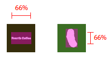
For medium tiles, limit the icon width to 66% and height to 50% of tile size. This prevents overlapping of elements in the branding bar:

For wide tiles, limit the icon width to 66% and height to 50% of tile size. This prevents overlapping of elements in the branding bar:

For large tiles, limit the icon width to 66% and height to 50% of tile size:

Some icons are designed to be horizontally or vertically oriented, while others have more complex shapes that prevent them from fitting squarely within the target dimensions. Icons that appear to be centered can be weighted to one side. In this case, parts of an icon may hang outside the recommended footprint, provided it occupies the same visual weight as a squarely fitted icon:

With full-bleed assets, take into account elements that interact within the margins and edges of the tiles. Maintain margins of at least 16% of the height or width of the tile. This percentage represents double the width of the margins at the smallest tile sizes:

In this example, margins are too tight:

Optimizing for specific themes, languages, and other conditions
This article described how to create assets for specific scale factors, but you can also create assets for a wide variety of conditions and combinations of conditions. For example, you can can create icons for high contrast displays or for the light themes and dark themes. You can even create assets for specific languages.
Значки приложений и логотипы App icons and logos
Каждое приложение имеет значок или логотип, который представляет его, и этот значок появляется в нескольких местах в оболочке Windows. Every app has an icon/logo that represents it, and that icon appears in multiple locations in the Windows shell:

В этой статье рассматриваются основы создания значков приложений, использование Visual Studio для управления ими и управление вручную по необходимости. This article covers the basics of creating app icons, how to use Visual Studio to manage them, and how manage them manually, should you need to.
(Эта статья посвящена значкам, которые представляют само приложение; общие рекомендации по значкам см. в статье Значки.) (This article is specifically for icons that represent the app itself; for general icon guidance, see the Icons article.)
Типы значков, расположения и масштабные коэффициенты Icon types, locations, and scale factors
По умолчанию Visual Studio сохраняет ваши активы значков в подкаталог активов. By default, Visual Studio stores your icon assets in an assets subdirectory. Вот список различных типов значков с указанием, где они появляются и как называются. Here’s a list of the different types of icons, where they appear, and what they’re called.
| Имя значка Icon name | Отображается в Appears in | Имя файла актива Asset file name |
|---|---|---|
| Маленькая плитка Small tile | Меню «Пуск» Start menu | SmallTile.png SmallTile.png |
| Средняя плитка Medium tile | Меню «Пуск», список Microsoft Store* Start menu, Microsoft Store listing* | Square150x150Logo.png Square150x150Logo.png |
| Широкая плитка Wide tile | Меню «Пуск» Start menu | Wide310x150Logo.PNG Wide310x150Logo.png |
| Большая плитка Large tile | Меню «Пуск», список Microsoft Store* Start menu, Microsoft Store listing* | LargeTile.png LargeTile.png |
| Значок приложения App icon | Список приложений в меню «Пуск», панель задач, диспетчер задач App list in start menu, task bar, task manager | Square44x44Logo.png Square44x44Logo.png |
| Экран-заставка Splash screen | Экран-заставка приложения The app’s splash screen | SplashScreen.png SplashScreen.png |
| Эмблема Badge logo | Плитки приложений Your app’s tiles | BadgeLogo.png BadgeLogo.png |
| Логотип упаковки / логотип Store Package logo/Store logo | Установщик приложений, Центр партнеров, параметр «Сообщить о приложении» в Store, параметр «Написать отзыв» в Store App installer, Partner Center, the «Report an app» option in the Store, the «Write a review» option in the Store | StoreLogo.png StoreLogo.png |
Чтобы эти значки выглядели четко на каждом экране, вы можете создать несколько версий одного и того же значка для разных масштабных коэффициентов дисплея. To ensure these icons look sharp on every screen, you can create multiple versions of the same icon for different display scale factors.
Коэффициент масштабирования определяет размер элементов пользовательского интерфейса, таких как текст. The scale factor determines the size of UI elements, such as text. Масштабирование факторов в диапазоне от 100 до 400 %. Scale factors range from 100% to 400%. Большие значения создают большие элементы пользовательского интерфейса, облегчая их просмотр на экранах с высоким разрешением. Larger values create larger UI elements, making them easier to see on high-DPI displays.
Windows автоматически задает коэффициент масштабирования для каждого дисплея на основе его показателя DPI (точек на дюйм) и расстояния от экрана устройства. Windows automatically sets the scale factor for each display based on its DPI (dots-per-inch) and the viewing distance of the device. (Пользователи могут переопределить значение по умолчанию, перейдя на страницу Параметры > Экран > Масштаб и разметка.) (Users can override the default value by going to the Settings > Display > Scale and layout page.)
Поскольку ресурсы значков приложений являются растровыми изображениями, а они плохо масштабируются, мы рекомендуем указывать версию каждого значка для каждого масштабного коэффициента: 100 %, 125 %, 150 %, 200 % и 400 %. Because app icon assets are bitmaps and bitmaps don’t scale well, we recommend providing a version each icon asset for each scale factor: 100%, 125%, 150%, 200%, and 400%. Значки занимают немало места! That’s a lot of icons! К счастью, Visual Studio предоставляет инструмент, который позволяет легко создавать и обновлять эти значки. Fortunately, Visual Studio provides a tool that makes it easy to generate and update these icons.
Список изображений Microsoft Store Microsoft Store listing image
«Как я могу указать изображения для списка моих приложений в Microsoft Store?» «How do I specify images for my app’s listing in the Microsoft Store?»
По умолчанию мы используем некоторые изображения из ваших пакетов в Store, как описано в таблице, которая находится в верхней части этой страницы (вместе с другими изображениями, которые вы предоставляете в процессе отправки). By default, we use some of the images from your packages in the Store, as described in the table at the top of this page (along with other images that you provide during the submission process). Тем не менее вы также можете настроить, чтобы при показе страницы приложения клиентам, использующим Windows 10 (включая Xbox), Store не мог использовать изображения логотипов из ваших пакетов приложения, а показывал только загружаемые изображения. However, you have the option to prevent the Store from using the logo images in your app’s packages when displaying your listing to customers on Windows 10 (including Xbox), and instead have the Store use only images that you upload. Так вы сможете эффективнее настроить внешний вид вашего приложения в Microsoft Store. This gives you more control over your app’s appearance in various displays throughout the Store. (Обратите внимание, что если ваш продукт поддерживает более ранние версии ОС, эти клиенты могут по-прежнему видеть изображения из ваших пакетов, даже если вы используете этот параметр.) Это можно сделать в разделе Логотипы Store на шаге процесса отправки Список Store. (Note that if your product supports earlier OS versions, those customers may still see images from your packages, even if you use this option.) You can do this in the Store logos section of the Store listing step of the submission process.
После установки этого флажка появится новый раздел под названием Отображение изображений Store. When you check this box, a new section called Store display images appears. Здесь вы можете загрузить 3 размера изображений, которые Store будет использовать вместо изображений логотипов из пакетов вашего приложения: 71 x 71, 150 x 150 и 300 x 300 пикселей. Here, you can upload 3 image sizes that the Store will use in place of logo images from your app’s packages: 300 x 300, 150 x 150, and 71 x 71 pixels. Требуется только размер 300 x 300, хотя мы рекомендуем предоставить все 3 размера. Only the 300 x 300 size is required, although we recommend providing all 3 sizes.
Управление значками приложений с помощью Конструктора манифестов в Visual Studio Managing app icons with the Visual Studio Manifest Designer
Visual Studio предоставляет очень полезное средство для управления значками приложений, которое называется Конструктор манифестов. Visual Studio provides a very useful tool for managing your app icons called the Manifest Designer.
Если у вас еще нет Visual Studio 2019, доступно несколько версий, включая бесплатную (Visual Studio 2019 Community Edition), а другие версии предлагают бесплатные пробные версии. If you don’t already have Visual Studio 2019, there are several versions available, including a free version, (Visual Studio 2019 Community Edition), and the other versions offer free trials. Их можно загрузить здесь: https://developer.microsoft.com/windows/downloads You can download them here: https://developer.microsoft.com/windows/downloads
Чтобы запустить Конструктор манифестов, необходимо следующее. To launch the Manifest Designer:
- В Visual Studio откройте проект универсальной платформы Windows. Use Visual Studio to open a UWP project.
- В обозревателе решений дважды щелкните Package.appxmanifest. In the Solution Explorer, double-click the Package.appmxanifest file.
Конструктор манифестов отображается в Visual Studio. Visual Studio displays the Manifest Designer.
- Щелкните вкладку Визуальные активы. Click the Visual Assets tab.
Создание всех активов одновременно Generating all assets at once
Первый пункт меню на вкладке Визуальные активы, Все визуальные активы, делает в точности то, что предлагает его название: создает каждый визуальный ресурс, необходимый вашему приложению, после нажатия кнопки. The first menu item in the Visual Assets tab, All Visual Assets, does exactly what its name suggests: generates every visual asset your app needs with the press of a button.
Все, что вам нужно сделать, — это предоставить одно изображение, и Visual Studio создаст маленькую, среднюю, большую, широкую, очень большую плитку, значок приложения, заставку и логотипы пакетов для каждого масштабного коэффициента. All you need to do is supply a single image, and Visual Studio will generate the small tile, medium tile, large tile, wide tile, large tile, app icon, splash screen, and package logo assets for every scale factor.
Чтобы создать все ресурсы одновременно, выполните следующее. To generate all assets at once:
Нажмите кнопку . рядом с полем Источник и выберите изображение, которое вы хотите использовать. Click the . next to the Source field and select the image you want to use. Для получения четких результатов убедитесь, что вы используете изображение (растровое) размером не менее 400 х 400 пикселей. If you’re using a bitmap image, make sure it’s at least 400 by 400 pixels so that you get sharp results. Но лучше всего подходят векторные изображения; Visual Studio позволяет использовать искусственный интеллект (Adobe Illustrator) и PDF-файлы. Vector-based images work best; Visual Studio lets you use AI (Adobe Illustrator) and PDF files.
(Дополнительно.) В разделе Параметры отображения настройте следующие параметры: (Optional.) In the Display Settings section, configure these options:
a. a. Короткое имя Укажите короткое имя для вашего приложения. Short name: Specify a short name for your app.
b. b. Показать имя. Укажите, хотите ли вы отображать короткое имя на средних, широких или больших плитках. Show name: Indicate whether you want to display the short name on medium, wide, or large tiles.
c. c. Фон плитки. Укажите шестнадцатеричное значение или имя цвета для фона плитки. Tile background: Specify the hex value or a color name for the tile background color. Например, #464646 . For example, #464646 . Значение по умолчанию: transparent . The default value is transparent .
d. d. Фон экрана-заставки. Укажите шестнадцатеричное значение или имя цвета для фона экрана-заставки. Spash screen background: Specify the hex value or color name for the spash screen background.
Щелкните Создать. Click Generate.
Visual Studio создает файлы изображений и добавляет их в проект. Visual Studio generates your image files and adds them to project. Если вы хотите изменить свои ресурсы, просто повторите процесс. If you want to change your assets, simply repeat the process.
Масштабируемые ресурсы значков соответствуют следующему соглашению об именах файлов. Scaled icon assets follow this file naming convention:
Имя файла-масштабирование-коэффициент масштабирования.png filename-scale-scale factor.png
Например: For example,
Square150x150Logo-scale-100.png, Square150x150Logo-scale-200.png, Square150x150Logo-scale-400.png Square150x150Logo-scale-100.png, Square150x150Logo-scale-200.png, Square150x150Logo-scale-400.png
Обратите внимание на то, что Visual Studio не создает логотип по умолчанию. Notice that Visual Studio doesn’t generate a badge logo by default. Это потому, что ваш логотип значка уникален и он не должен соответствовать значкам других приложений. That’s because your badge logo is unique and probably shouldn’t match your other app icons. См. сведения об уведомлениях на индикаторах событий для приложений для Windows. For more info, see the Badge notifications for Windows apps article.
Подробнее о ресурсах значков приложения More about app icon assets
Visual Studio сгенерирует все ресурсы значков приложения, необходимые для вашего проекта, но в процессе настройки вы увидите, чем они отличаются от других ресурсов приложения. Visual Studio will generate all the app icon assets required by your project, but if you’d like to customize them, it helps to understand how they’re different from other app assets.
Ресурс значка приложения отображается во многих местах: на панели задач Windows, в виде задач, ALT+TAB и в правом нижнем углу плиток в меню «Пуск». The app icon asset appears in a lot of places: the Windows taskbar, the task view, ALT+TAB, and the lower-right corner of Start tiles. Поскольку ресурс значка приложения появляется во многих местах, у него есть некоторые дополнительные параметры определения размера и размещения, которых нет у других ресурсов: ресурсы «целевого размера» и ресурсы «без основы». Because the app icon asset appears in so many places, it has some additional sizing and plating options the other assets don’t have: «target-size» assets and «unplated» assets.
Ресурсы значков приложения целевого размера Target-size app icon assets
В дополнение к стандартным размерам масштабного коэффициента («Square44x44Logo.scale-400.png»), мы также рекомендуем создавать ресурсы «целевого размера». In addition to the standard scale factor sizes («Square44x44Logo.scale-400.png»), we also recommend creating «target-size» assets. Мы называем их ресурсами целевого размера, потому что они нацелены на конкретные размеры, например 16 пикселей, а не на конкретные масштабные коэффициенты, например 400. We call these assets target-size because they target specific sizes, such as 16 pixels, rather than specific scale factors, such as 400. Ресурсы целевого размера предназначены для областей, которые не используют позицию масштабирования системы: Target-size assets are for surfaces that don’t use the scaling plateau system:
- список переходов на начальном экране (компьютеры); Start jump list (desktop)
- нижний угол плитки начального экрана (компьютеры); Start lower corner of tile (desktop)
- сочетания клавиш (компьютеры); Shortcuts (desktop)
- панель управления (компьютеры). Control Panel (desktop)
Ниже приведен список ресурсов целевого размера. Here’s the list of target-size assets:
| Размер ресурса Asset size | Пример имени файла File name example |
|---|---|
| 16×16* 16×16* | Square44x44Logo.targetsize-16.png Square44x44Logo.targetsize-16.png |
| 24×24* 24×24* | Square44x44Logo.targetsize-24.png Square44x44Logo.targetsize-24.png |
| 32×32* 32×32* | Square44x44Logo.targetsize-32.png Square44x44Logo.targetsize-32.png |
| 48×48* 48×48* | Square44x44Logo.targetsize-48.png Square44x44Logo.targetsize-48.png |
| 256×256* 256×256* | Square44x44Logo.targetsize-256.png Square44x44Logo.targetsize-256.png |
| 20×20 20×20 | Square44x44Logo.targetsize-20.png Square44x44Logo.targetsize-20.png |
| 30×30 30×30 | Square44x44Logo.targetsize-30.png Square44x44Logo.targetsize-30.png |
| 36×36 36×36 | Square44x44Logo.targetsize-36.png Square44x44Logo.targetsize-36.png |
| 40×40 40×40 | Square44x44Logo.targetsize-40.png Square44x44Logo.targetsize-40.png |
| 60×60 60×60 | Square44x44Logo.targetsize-60.png Square44x44Logo.targetsize-60.png |
| 64×64 64×64 | Square44x44Logo.targetsize-64.png Square44x44Logo.targetsize-64.png |
| 72×72 72×72 | Square44x44Logo.targetsize-72.png Square44x44Logo.targetsize-72.png |
| 80×80 80×80 | Square44x44Logo.targetsize-80.png Square44x44Logo.targetsize-80.png |
| 96×96 96×96 | Square44x44Logo.targetsize-96.png Square44x44Logo.targetsize-96.png |
* Как минимум мы рекомендуем предоставить эти размеры. * At a minimum, we recommend providing these sizes.
Для таких ресурсов не нужно добавлять заполнение, так как Windows добавит его при необходимости. You don’t have to add padding to these assets; Windows adds padding if needed. Для этих ресурсов предусмотрен минимальный занимаемый объем памяти (16 пикселей). These assets should account for a minimum footprint of 16 pixels.
Ниже приведен пример таких ресурсов в том виде, в котором они отображаются в значках на панели задач Windows. Here’s an example of these assets as they appear in icons on the Windows taskbar:

Ресурсы без основы Unplated assets
По умолчанию Windows использует целевой ресурс поверх цветной задней панели по умолчанию. By default, Windows uses a target-based asset on top of a colored backplate by default. Если вы хотите, вы можете предоставить целевой ресурс без основы. If you want, you can provide a target-based unplated asset. «Без основы» означает, что ресурс будет отображаться на прозрачном фоне. «Unplated» means the asset will be displayed on a transparent background. Имейте в виду, что эти ресурсы будут отображаться на различных цветах фона. Keep in mind that these assets will appear over a variety of background colors.

Ниже приведены также области, которые используют ресурсы значков приложений без основы. Here are the surfaces that use unplated app icon assets:
- Панель задач и эскиз панели задач (компьютеры) Taskbar and taskbar thumbnail (desktop)
- Список переходов на панели задач Taskbar jumplist
- Представление задач Task view
- ALT+TAB ALT+TAB
Ресурсы без основы и тем Unplated assets and themes
Выбранная пользователем тема определяет цвет панели задач. The user’s selected theme determines the color of the taskbar. Если ресурс без основы не определен специально для текущей темы, система проверяет его на контрастность. If the unplated asset isn’t specifically qualified for the current theme, the system checks the asset for contrast. Если он имеет достаточный контраст с панелью задач, система использует его. If it has enough contrast with taskbar, the system uses it. В противном случае система ищет версию ресурса высокой контрастности. Otherwise, the system looks for a high-contrast version of the asset. Если ей не удается его найти, вместо этого система рисует основу ресурса. If it can’t find one, the system draws the plated form of the asset instead.
Целевой объект и изменения размера без основы Target and unplated sizing
Вот рекомендации по размерам для специальных ресурсов в масштабе 100 %: Here are the size recommendations for target-based assets, at 100% scale:

Подробнее о ресурсах экрана-заставки More about splash screen assets
Подробнее об эмблемах ресурсов More about badge logo assets
Когда вы используете генератор ресурсов для создания всех необходимых вам ресурсов, есть причина, по которой он не создает эмблемы значков по умолчанию: они сильно отличаются от других ресурсов приложения. When you use the asset generator to generate all the assets you need, there’s a reason why it doesn’t generate badge logos by default: they’re very different from other app assets. Эмблема — это состояние изображения, которое отображается в уведомлениях и на плитках приложений. The badge logo is a status image that appears in notifications and on the app’s tiles.
Настройка заполнения ресурсов Customizing asset padding
По умолчанию генератор ресурсов Visual Studio применяет рекомендуемое заполнение любого изображения. By default, Visual Studio asset generator applies recommended padding to whatever image. Если ваши изображения уже содержат заполнения или вы хотите, чтобы полные изображения занимали пространство до конца плитки, вы можете отключить эту функцию, сняв флажок Применить рекомендуемое заполнение. If your images already contain padding or you want full bleed images that extend to the end of the tile, you can turn this feature off by unchecking the Apply recommended padding check box.
Рекомендации по заполнению плитки Tile padding recommendations
Если вы хотите предоставить собственные заполнения, ниже приведены наши рекомендации для плиток. If you want to provide your own padding, here are our recommendations for tiles.
4 размера плитки: маленькая (71 x 71), средняя (150 x 150), широкая (310 x 150) и большая (310 x 310). There are 4 tile sizes: small (71 x 71), medium (150 x 150), wide (310 x 150), and large (310 x 310).
Каждый ресурс плитки имеет такой же размер, что и плитка, на которой он размещен. Each tile asset is the same size as the tile on which it is placed.
Если вы не хотите, чтобы ваш значок переместился до края плитки, вы можете использовать прозрачные пиксели в вашем ресурсе для создания заполнения. If you don’t want your icon to extend to the edge of the tile, you can use transparent pixels in your asset to create padding.

Если плитка маленькая, то значок должен иметь такую ширину и высоту, чтобы его размер составлял не более 66 % от размера плитки: For small tiles, limit the icon width and height to 66% of the tile size:

Если плитка средняя, то ширина значка должна составлять 66 %, а высота — 50 % от размера плитки. For medium tiles, limit the icon width to 66% and height to 50% of tile size. Это позволит избежать наложения элементов в фирменной панели: This prevents overlapping of elements in the branding bar:

Если плитка широкая, то ширина значка должна составлять 66 %, а высота — 50 % от размера плитки. For wide tiles, limit the icon width to 66% and height to 50% of tile size. Это позволит избежать наложения элементов в фирменной панели: This prevents overlapping of elements in the branding bar:

Для крупных плиток ширина значка должна составлять 66 %, а высота — 50 % от размера плитки. For large tiles, limit the icon width to 66% and height to 50% of tile size:

Некоторые значки специально созданы под горизонтальную или вертикальную ориентацию, другие имеют более сложную форму, которая не позволяет расположить их на квадратном участке в нужном размере. Some icons are designed to be horizontally or vertically oriented, while others have more complex shapes that prevent them from fitting squarely within the target dimensions. Значки, которые выглядят выровненными по центру, могут быть больше с одной стороны. Icons that appear to be centered can be weighted to one side. В этом случае часть значка может выступать за контур рекомендуемого участка размещения при условии, что визуально этот значок занимает такое же пространство, как и квадратный значок: In this case, parts of an icon may hang outside the recommended footprint, provided it occupies the same visual weight as a squarely fitted icon:

Если используются полные ресурсы без заполнения, необходимо учитывать элементы, пересекающие поля и края плиток. With full-bleed assets, take into account elements that interact within the margins and edges of the tiles. Поля должны занимать не менее 16 % высоты или ширины плитки. Maintain margins of at least 16% of the height or width of the tile. Это значение соответствует удвоенной ширине полей самой маленькой плитки: This percentage represents double the width of the margins at the smallest tile sizes:

В этом примере поля слишком узкие: In this example, margins are too tight:

Оптимизация под конкретные темы, языки и другие условия Optimizing for specific themes, languages, and other conditions
В этой статье описывается, как создавать ресурсы для определенных масштабных факторов, но вы также можете создавать ресурсы для самых разных условий и комбинаций условий. This article described how to create assets for specific scale factors, but you can also create assets for a wide variety of conditions and combinations of conditions. Например, вы можете создавать значки для высококонтрастных дисплеев или для светлых и темных тем. For example, you can can create icons for high contrast displays or for the light themes and dark themes. Можно даже создавать ресурсы для определенных языков. You can even create assets for specific languages.


