Command bars provide users with easy access to your app’s most common tasks. Command bars can provide access to app-level or page-specific commands and can be used with any navigation pattern.
Is this the right control?
The CommandBar control is a general-purpose, flexible, light-weight control that can display both complex content, such as images or text blocks, as well as simple commands such as AppBarButton, AppBarToggleButton, and AppBarSeparator controls.
XAML provides both the AppBar control and the CommandBar control. You should use the AppBar only when you are upgrading a Universal Windows 8 app that uses the AppBar, and need to minimize changes. For new apps in Windows 10, we recommend using the CommandBar control instead. This document assumes you are using the CommandBar control.
Examples
XAML Controls Gallery
If you have the XAML Controls Gallery app installed, click here to open the app and see the CommandBar in action.
An expanded command bar.
Anatomy
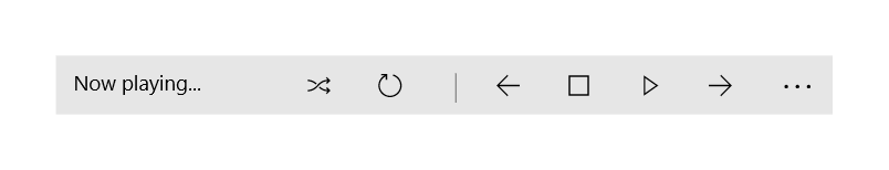
By default, the command bar shows a row of icon buttons and an optional «see more» button, which is represented by an ellipsis [•••]. Here’s the command bar created by the example code shown later. It’s shown in its closed compact state.
The command bar can also be shown in a closed minimal state that looks like this. See the Open and closed states section for more info.
Here’s the same command bar in its open state. The labels identify the main parts of the control.
The command bar is divided into 4 main areas:
The content area is aligned to the left side of the bar. It is shown if the Content property is populated.
The primary command area is aligned to the right side of the bar. It is shown if the PrimaryCommands property is populated.
The «see more» [•••] button is shown on the right of the bar. Pressing the «see more» [•••] button reveals primary command labels and opens the overflow menu if there are secondary commands. The button will not be visible when no primary command labels or secondary labels are present. To change default behavior, use the OverflowButtonVisibility property.
The overflow menu is shown only when the command bar is open and the SecondaryCommands property is populated. When space is limited, primary commands will move into the SecondaryCommands area. To change default behavior, use the IsDynamicOverflowEnabled property.
The layout is reversed when the FlowDirection is RightToLeft.
Create a command bar
This example creates the command bar shown previously.
Commands and content
The CommandBar control has 3 properties you can use to add commands and content: PrimaryCommands, SecondaryCommands, and Content.
Commands
By default, command bar items are added to the PrimaryCommands collection. You should add commands in order of their importance so that the most important commands are always visible. When the command bar width changes, such as when users resize their app window, primary commands dynamically move between the command bar and the overflow menu at breakpoints. To change this default behavior, use the IsDynamicOverflowEnabled property.
On the smallest screens (320 epx width), a maximum of 4 primary commands fit in the command bar.
You can also add commands to the SecondaryCommands collection, which are shown in the overflow menu.
You can programmatically move commands between the PrimaryCommands and SecondaryCommands as needed.
If there is a command that would appear consistently across pages, it’s best to keep that command in a consistent location.
We recommended placing Accept, Yes, and OK commands to the left of Reject, No, and Cancel. Consistency gives users the confidence to move around the system and helps them transfer their knowledge of app navigation from app to app.
App bar buttons
Both the PrimaryCommands and SecondaryCommands can be populated only with AppBarButton, AppBarToggleButton, and AppBarSeparator command elements.
The app bar button controls are characterized by an icon and text label. These controls are optimized for use in a command bar, and their appearance changes depending on whether the control is used in the command bar or the overflow menu.
Icons
The size of the icons when shown in the primary command area is 20x20px; in the overflow menu, icons are displayed at 16x16px. If you use SymbolIcon, FontIcon, or PathIcon, the icon will automatically scale to the correct size with no loss of fidelity when the command enters the secondary command area.
For more information and examples of setting the icon, see the documentation for the AppBarButton class.
Labels
The AppBarButton IsCompact property determines whether the label is shown. In a CommandBar control, the command bar overwrites the button’s IsCompact property automatically as the command bar is opened and closed.
To position app bar button labels, use CommandBar’s DefaultLabelPosition property.
On larger windows, consider moving labels to the right of app bar button icons to improve legibility. Labels on the bottom require users to open the command bar to reveal labels, while labels on the right are visible even when command bar is closed.
In overflow menus, labels are positioned to the right of icons by default, and LabelPosition is ignored. You can adjust the styling by setting the CommandBarOverflowPresenterStyle property to a Style that targets the CommandBarOverflowPresenter.
Button labels should be short, preferably a single word. Longer labels below an icon will wrap to multiple lines, increasing the overall height of the opened command bar. You can include a soft-hyphen character (0x00AD) in the text for a label to hint at the character boundary where a word break should occur. In XAML, you express this using an escape sequence, like this:
When the label wraps at the hinted location, it looks like this.
Command bar flyouts
Consider logical groupings for the commands, such as placing Reply, Reply All, and Forward in a Respond menu. While typically an app bar button activates a single command, an app bar button can be used to show a MenuFlyout or Flyout with custom content.
Other content
You can add any XAML elements to the content area by setting the Content property. If you want to add more than one element, you need to place them in a panel container and make the panel the single child of the Content property.
When dynamic overflow is enabled, content will not clip because primary commands can move into the overflow menu. Otherwise, primary commands take precedence and may cause the content to be clipped.
When the ClosedDisplayMode is Compact, the content can be clipped if it is larger than the compact size of the command bar. You should handle the Opening and Closed events to show or hide parts of the UI in the content area so that they aren’t clipped. See the Open and closed states section for more info.
Open and closed states
The command bar can be open or closed. When it’s open, it shows primary command buttons with text labels and it opens the overflow menu (if there are secondary commands). The command bar opens the overflow menu upwards (above the primary commands) or downwards (below the primary commands). The default direction is up, but if there’s not enough space to open the overflow menu upwards, the command bar opens it downwards.
A user can switch between these states by pressing the «see more» [•••] button. You can switch between them programmatically by setting the IsOpen property.
You can use the Opening, Opened, Closing, and Closed events to respond to the command bar being opened or closed.
The Opening and Closing events occur before the transition animation begins.
The Opened and Closed events occur after the transition completes.
In this example, the Opening and Closing events are used to change the opacity of the command bar. When the command bar is closed, it’s semi-transparent so the app background shows through. When the command bar is opened, the command bar is made opaque so the user can focus on the commands.
IsSticky
If a user interacts with other parts of an app when a command bar is open, then the command bar will automatically close. This is called light dismiss. You can control light dismiss behavior by setting the IsSticky property. When IsSticky=»true» , the bar remains open until the user presses the «see more» [•••] button or selects an item from the overflow menu.
We recommend avoiding sticky command bars because they don’t conform to users’ expectations for light dismiss and keyboard focus behavior.
Display Mode
You can control how the command bar is shown in its closed state by setting the ClosedDisplayMode property. There are 3 closed display modes to choose from:
Compact: The default mode. Shows content, primary command icons without labels, and the «see more» [•••] button.
Minimal: Shows only a thin bar that acts as the «see more» [•••] button. The user can press anywhere on the bar to open it.
Hidden: The command bar is not shown when it’s closed. This can be useful for showing contextual commands with an inline command bar. In this case, you must open the command bar programmatically by setting the IsOpen property or changing the ClosedDisplayMode to Minimal or Compact.
Here, a command bar is used to hold simple formatting commands for a RichEditBox. When the edit box doesn’t have focus, the formatting commands can be distracting, so they’re hidden. When the edit box is being used, the command bar’s ClosedDisplayMode is changed to Compact so the formatting commands are visible.
NoteВ В The implementation of the editing commands is beyond the scope of this example. For more info, see the RichEditBox article.
Although the Minimal and Hidden modes are useful in some situations, keep in mind that hiding all actions could confuse users.
Changing the ClosedDisplayMode to provide more or less of a hint to the user affects the layout of surrounding elements. In contrast, when the CommandBar transitions between closed and open, it does not affect the layout of other elements.
Placement
Command bars can be placed at the top of the app window, at the bottom of the app window, and inline, by embedding them in a layout control such as Grid.row .
For small handheld devices, we recommend positioning command bars at the bottom of the screen for easy reachability.
For devices with larger screens, placing command bars near the top of the window makes them more noticeable and discoverable.
Use the DiagonalSizeInInches API to determine physical screen size.
Command bars can be placed in the following screen regions on single-view screens (left example) and on multi-view screens (right example). Inline command bars can be placed anywhere in the action space.
Touch devices: If the command bar must remain visible to a user when the touch keyboard, or Soft Input Panel (SIP), appears then you can assign the command bar to the BottomAppBar property of a Page and it will move to remain visible when the SIP is present. Otherwise, you should place the command bar inline and positioned relative to your app content.
Taskbar Extensions
As of WindowsВ 7, the taskbar has been extended significantly under the guiding principle of getting users where they’re going as quickly and efficiently as possible. To that end, the application windows, files, and commands that the user needs to accomplish that are now centralized into a single taskbar button that consolidates previously scattered information sources and controls. A user can now find common tasks, recent and frequent files, alerts, progress notifications, and thumbnails for individual documents or tabs all in one place.
Unified Launching and Switching
As of the WindowsВ 7 taskbar, Quick Launch is no longer a separate toolbar. The launcher shortcuts that Quick Launch typically contained are now pinned to the taskbar itself, mingled with buttons for currently running applications. When a user starts an application from a pinned launcher shortcut, the icon transforms into the application’s taskbar button for as long as the application is running. When the user closes the application, the button reverts to the icon. However, both the launcher shortcut and the button for the running application are just different forms of the WindowsВ 7 taskbar button.
A small set of applications are pinned by default for new installations. Other than these, only the user can pin further applications; programmatic pinning by an application is not permitted.
The Show Desktop feature from Quick Launch is now located at the taskbar’s far right. Hovering over this area causes all active windows to become transparent, showing the desktop. Clicking the area executes the familiar action of minimizing all windows and switching to the desktop.
While the application is running, its taskbar button becomes the single place to access all of the following features, each discussed in detail below.
Tasks: common application commands, present even when the application is not running.
Destinations: recently and frequently accessed files specific to the application.
Thumbnails: window switching, including switch targets for individual tabs and documents.
Thumbnail Toolbars: basic application control from the thumbnail itself.
Progress Bars and Icon Overlays: status notifications.
The taskbar button can represent a launcher, a single application window, or a group. An identifier known as an Application User Model ID (AppUserModelID) is assigned to each group. An AppUserModelID can be specified to override standard taskbar grouping, which allows windows to become members of the same group when they might not otherwise be seen as such. Each member of a group is given a separate preview in the thumbnail flyout that is shown when the mouse hovers over the group’s taskbar button. Note that grouping itself remains optional.
As of WindowsВ 7, taskbar buttons can now be rearranged by the user through drag-and-drop operations.
The Quick Launch folder (FOLDERID_QuickLaunch) is still available for backward compatibility although there is no longer a Quick Launch UI. However, new applications should not ask to add an icon to Quick Launch during installation.
Jump Lists
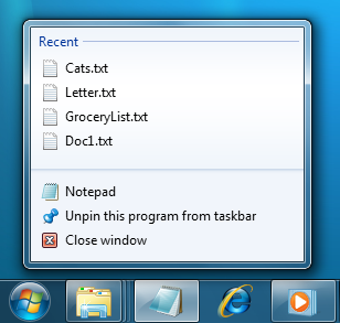
A user typically launches a program with the intention of accessing a document or performing tasks within the program. The user of a game program might want to get to a saved game or launch as a specific character rather than restart a game from the beginning. To get users more efficiently to their final goal, a list of destinations and common tasks associated with an application is attached to that application’s taskbar button (as well as to the equivalent Start menu entry). This is the application’s Jump List. The Jump List is available whether the taskbar button is in a launcher state (the application isn’t running) or whether it represents one or more windows. Right-clicking the taskbar button shows the application’s Jump List, as shown in the following illustration.
By default, a standard Jump List contains two categories: recent items and pinned items, although because only categories with content are shown in the UI, neither of these categories are shown on first launch. Always present are an application launch icon (to launch more instances of the application), an option to pin or unpin the application from the taskbar, and a Close command for any open windows.
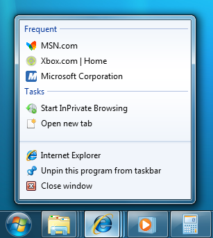
Destinations
The Recent and Frequent categories are considered to contain destinations. A destination, usually a file, document, or URL, is something that can be edited, browsed, viewed, and so on. Think of a destination as a thing rather than an action. Typically, a destination is an item in the Shell namespace, represented by an IShellItem or IShellLink. These portions of the destination list are analogous to the Start menu’s recently used documents list (no longer shown by default) and frequently used application list, but they are specific to an application and therefore more accurate and useful to the user. The results used in the destination list are calculated through calls to SHAddToRecentDocs. Note that when the user opens a file from Windows Explorer or uses the common file dialog to open, save, or create a file, SHAddToRecentDocs is called for you automatically, which results in many applications getting their recent items shown in the destination list without any action on their part.
Launching a destination is much like launching an item using the Open With command. The application launches with that destination loaded and ready to use. Items in the destination list can also be dragged from the list to a drop destination such as an email message. By having these items centralized in a destination list, it gets users where they want to go that much faster, which is the goal.
As items appear in a destination list’s Recent category (or the Frequent category or a custom category as discussed in a later section), a user might want to ensure that the item is always in the list for quick access. To accomplish this, he or she can pin that item to the list, which adds the item to the Pinned category. When a user is actively working with a destination, he or she wants it easily at hand and so would pin it to the application’s destination list. After the user’s work there is done, he or she simply unpins the item. This user control keeps the list uncluttered and relevant.
A destination list can be regarded as an application-specific version of the Start menu. A destination list is not a shortcut menu. Each item in a destination list can be right-clicked for its own shortcut menu.
Tasks
Another built-in portion of a Jump List is the Tasks category. While a destination is a thing, a task is an action, and in this case it is an application-specific action. Put another way, a destination is a noun and a task is a verb. Typically, tasks are IShellLink items with command-line arguments that indicate particular functionality that can be triggered by an application. Again, the idea is to centralize as much information related to an application as is practical.
Applications define tasks based on both the program’s features and the key things a user is expected to do with them. Tasks should be context-free, in that the application does not need to be running for them to work. They should also be the statistically most common actions that a normal user would perform in an application, such as compose an email message or open the calendar in a mail program, create a new document in a word processor, launch an application in a certain mode, or launch one of its subcommands. An application should not clutter the menu with advanced features that standard users won’t need or one-time actions such as registration. Do not use tasks for promotional items such as upgrades or special offers.
It is strongly recommended that the task list be static. It should remain the same regardless of the state or status of the application. While it is possible to vary the list dynamically, you should consider that this could confuse the user who does not expect that portion of the destination list to change.
Customizing Jump Lists
An application can define its own categories and add them in addition to or in place of the standard Recent and Frequent categories in a Jump List. The application can control its own destinations in those custom categories based on the application’s architecture and intended use. The following screen shot shows a Custom Jump List with a History category.
If an application decides to provide a custom category, that application assumes responsibility for populating it. The category contents should still be user-specific and based on user history, actions, or both, but through a custom category an application can determine what it wants to track and what it wants to ignore, perhaps based on an application option. For example, an audio program might elect to include only recently played albums and ignore recently played individual tracks.
If a user has removed an item from the list, which is always a user option, the application must honor that. The application must also ensure that items in the list are valid or that they fail gracefully if they have been deleted. Individual items or the entire contents of the list can be programmatically removed.
The maximum number of items in a destination list is determined by the system based on various factors such as display resolution and font size. If there isn’t space enough for all items in all categories, they are truncated from the bottom up.
Thumbnail Toolbars
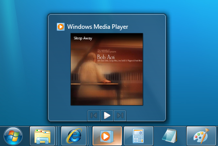
To provide access to a particular window’s key commands without making the user restore or activate the application’s window, an active toolbar control can be embedded in that window’s thumbnail preview. For example, Windows Media Player might offer standard media transport controls such as play, pause, mute, and stop. The UI displays this toolbar directly below the thumbnail as shown in the following illustration—it does not cover any part of it.
This toolbar is simply the familiar standard toolbar common control. It has a maximum of seven buttons. Each button’s ID, image, tooltip, and state are defined in a structure, which is then passed to the taskbar. The application can show, enable, disable, or hide buttons from the thumbnail toolbar as required by its current state.
Because there is limited room to display thumbnails and a variable number of thumbnails to display, applications are not guaranteed a given toolbar size. If space is restricted, buttons in the toolbar are truncated from right to left. Therefore, when you design your toolbar, you should prioritize the commands associated with your buttons and ensure that the most important come first and are least likely to be dropped because of space issues.
When an application displays a window, its taskbar button is created by the system. When the button is in place, the taskbar sends a TaskbarButtonCreated message to the window. Its value is computed by calling RegisterWindowMessage(L(«TaskbarButtonCreated»)). That message must be received by your application before it calls any ITaskbarList3 method.
Icon Overlays
An application can communicate certain notifications and status to the user through its taskbar button by the display of small overlays on the button. These overlays are similar to the type of existing overlay used for shortcuts or security notifications, displayed at the lower-right corner of the button. To display an overlay icon, the taskbar must be in the default large icon mode, as shown in the following screen shot.
Icon overlays serve as a contextual notification of status, and are intended to negate the need for a separate notification area status icon to communicate that information to the user. For instance, the new mail status in Microsoft Outlook, currently shown in the notification area, can now be indicated through an overlay on the taskbar button. Again, you must decide during your development cycle which method is best for your application. Overlay icons are intended to supply important, long-standing status or notifications such as network status, messenger status, or new mail. The user should not be presented with constantly changing overlays or animations.
Because a single overlay is overlaid on the taskbar button and not on the individual window thumbnails, this is a per-group feature rather than per-window. Requests for overlay icons can be received from individual windows in a taskbar group, but they do not queue. The last overlay received is the overlay shown.
Progress Bars
A taskbar button can be used to display a progress bar. This enables a window to provide progress information to the user without that user having to switch to the window itself. The user can stay productive in another application while seeing at a glance the progress of one or more operations occurring in other windows. It is intended that a progress bar in a taskbar button reflects a more detailed progress indicator in the window itself. This feature can be used to track file copies, downloads, installations, media burning, or any operation that’s going to take a period of time. This feature is not intended for use with normally peripheral actions such as the loading of a webpage or the printing of a document. That type of progress should continue to be shown in a window’s status bar.
The taskbar button progress bar is a similar experience to the familiar Progress Bar control. It can display either determinate progress based on a completed percentage of the operation or an indeterminate marquee-style progress to indicate that the operation is in progress without any prediction of time remaining. It can also show that the operation is paused or has encountered an error and requires user intervention.
Deskbands
In versions of Windows prior to WindowsВ 7, something similar to thumbnail toolbar functionality could be achieved through a deskband—a toolbar hosted in the taskbar. For instance, Windows Media Player could minimize to the taskbar as a set of transport controls rather than a standard button. In WindowsВ 7, deskbands can still be implemented and thumbnail toolbars are not intended to replace them all. Not all applications will lend themselves to a thumbnail toolbar, and another solution such as a deskband or a task in a destination list might be the right answer for your application; you must decide which solution works best for your application as part of your development cycle. However, be aware that deskbands must support Windows Aero with translucency («glass») enabled and the IDeskBand2 interface.
Notification Area
There have been changes to the notification area that give the user much more control over what icons appear on the taskbar. All notification icons are now hidden by default and that visibility cannot be programmatically controlled. Only the user is allowed to choose which notification icons appear on the taskbar. When a notification balloon is displayed, the icon becomes temporarily visible, but even then a user can choose to silence them. An icon overlay on a taskbar button therefore becomes an attractive choice when you want your application to communicate that information to your users.
Thumbnails
In WindowsВ Vista, hovering over an application’s taskbar button displays a thumbnail that represents the running window. If the taskbar has collapsed the application’s windows, the thumbnail represents this by appearing as a stack, but only the active window is shown in the thumbnail itself.
In WindowsВ 7, each member of a group is shown as a separate thumbnail and is now also a switch target. An application can define its children (such as true child windows, individual documents, or tabs) and provide corresponding thumbnails for each of those windows even when they would not normally appear in the taskbar. This enables users to switch directly into the view of the application that they want rather than switching into the application and then switching to their destination. For example, multiple-document interface (MDI)/tabbed-document interface (TDI)applications can have each document or tab displayed as a separate thumbnail and switch target when the mouse hovers over a group’s taskbar button.
As in WindowsВ Vista, Aero must be active to view thumbnails.
Thumbnail representations for windows are normally automatic, but in cases where the result isn’t optimal, the thumbnail can be explicitly specified. By default, only top-level windows have a thumbnail automatically generated for them, and the thumbnails for child windows appear as a generic representation. This can result in a less than ideal (and even confusing) experience for the end user. A specific switch target thumbnail for each child window, for instance, provides a much better user experience.
You can select a particular area of the window to use as the thumbnail. This can be useful when an application knows that its documents or tabs will appear similar when viewed at thumbnail size. The application can then choose to show just the part of its client area that the user can use to distinguish between thumbnails. However, hovering over any thumbnail brings up a view of the full window behind it so the user can quickly glance through them as well.
If there are more thumbnails than can be displayed, the preview reverts to the legacy thumbnail or a standard icon.
To add Pin to Taskbar to an item’s shortcut menu, which is normally required only for file types that include the IsShortCut entry, is done by registering the appropriate context menu handler. This also applies to Pin to Start Menu. See Registering Shell Extension Handlers for more information.