- Change the default font in Word
- If the default font setting doesn’t persist
- If the default font setting doesn’t persist
- Embed fonts in documents or presentations
- Embed fonts in Word or PowerPoint
- Troubleshooting
- Embed fonts in a document or presentation
- Recommendations for embedding fonts
- Troubleshooting
- Requirements for embedded fonts
- Requirements for displaying embedded fonts
- Fonts
- Design concepts
- Fonts, typefaces, point sizes, and attributes
- Serif and sans serif
- Contrast
- Affordances
- Accessibility and the system font, sizes, and colors
Change the default font in Word
To use your favorite font in Word all the time, set it as the default.
Go to Home, and then select the Font Dialog Box Launcher  .
.
Select the font and size you want to use.
Select Set As Default.
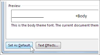
Select one of the following:
This document only
All documents based on the Normal template.
Select OK twice.
If the default font setting doesn’t persist
Sometimes, a company’s permission settings or some add-ins change the default font back to the original font. If that’s happening, here are some things to try.
In the Search box, type Normal.dotm and select Search.
Right-click Normal.dotm, and select Properties.
On the General tab, make sure Read-only isn’t checked. If it’s checked, uncheck it.
Select the Security tab. Under Group or user names, select your name, and then make sure you have Write permission in the Permissions box.
If you aren’t able to uncheck the Read-only box or if you don’t have Write permission, contact the person who’s in charge of your company’s computer systems.
If you have Write permissions and the default font setting still doesn’t stick, you might have to turn off Word add-ins and change the default font setting. Here’s how:
Select File > Options > Add-Ins.
In the Add-ins box, find one of the add-ins you want to turn off and note the add-in type listed in the Type column.
Select that add-in type in the Manage list, and select Go.
Uncheck the boxes for the add-ins you want to turn off, and select OK.
Repeat steps 1-4 for other types of add-ins.
After you change the default font, turn on the add-ins.
Select File > Options > Add-Ins.
Select an Add-in type in the Manage list, and select Go.
Check the boxes for the add-ins you want to turn on, and select OK.
Repeat steps 1-3 for the other types of add-ins you want to turn on.
Note: You don’t have to turn off the Document Inspector type add-ins.
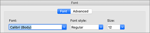
To use your favorite font in Word all the time, set it as the default.
Go to Format > Font > Font.
You can also press and hold  + D to open the Font dialog box.
Select the font and size you want to use.
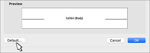
Select Default, and then select Yes.
If the default font setting doesn’t persist
Sometimes, a company’s permission settings change the default font back to the original font. If that’s happening, try this:
Open Finder, and in the Search box, type Normal.dotm.
On the File menu, select Get Info. Or, press and hold + I.
Select General, and make sure Locked is unchecked. If it’s checked, uncheck it.
Select Sharing & Permissions, and next to your name, make sure you have Read & Write permission under Privilege.
If you aren’t able to uncheck the Locked box or if you don’t have Read & Write permission, contact the person who’s in charge of your company’s computer systems.
Embed fonts in documents or presentations
Some Office apps let you embed fonts in your documents. That way, if you share your document with someone else who doesn’t have the same fonts installed that you do, the fonts, layout, and styling of the document won’t change, and special characters won’t turn into meaningless rectangles.
In recent years we’ve moved our Office fonts to the cloud, so they’re available to all Office subscribers with Internet access and there’s no need to embed them. Font embedding is still useful when using non-standard fonts, or if you expect the presentation to be edited or viewed offline by someone else.

Embed fonts in Word or PowerPoint
Click the File tab and then click Options (it’s near the bottom left corner of the window).
In the left column, select the Save tab.
At the bottom, under Preserve fidelity when sharing this presentation, select the Embed fonts in the file check box.
 Options to turn on font embedding for your file»>
Selecting Embed only the characters used in the presentation reduces the file size but limits editing of the file using the same font. Leaving that check box blank increases the file size, but is best for allowing others to edit the document and keep the same font.
We recommend leaving the check box blank if the other person may edit the file.
Troubleshooting
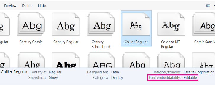
Is embedding your font still not working? Not all TrueType fonts can be embedded. Font creators can set different options for their fonts, including: Non-embeddable, Preview/Print, Editable, and Installable. To see what level of embedding your installed font is, go to Control Panel in Windows and click Fonts. Clicking on the font shows the Font embeddability setting.
Office cloud fonts won’t appear in this list, but you rarely need to embed those anyhow since they’ll automatically download if they’re not already installed on the machine that opened the file.
Is your file size too large after embedding fonts? Certain fonts can be very large compared to others, so if file size is a concern, consider using alternative fonts. If you want to remove the embedding, you can turn off the Embed setting in the File > Options dialog box (described above) and save the file. Then, once you close and re-open the file, a different font is substituted for the font that had been embedded previously.
- Select which version of Office for macOS you’re using
- Microsoft 365 / 2019 for Mac
- Office 2016 for Mac
In Word for Microsoft 365 for Mac, PowerPoint for Microsoft 365 for Mac and PowerPoint 2019 for Mac, you can embed fonts in a presentation.
Word 2019 for Mac and Excel 2019 for Mac don’t currently support embedded fonts.
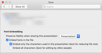
Embed fonts in a document or presentation
 This feature is only available to Microsoft 365 Subscribers and in PowerPoint 2019 for Mac, version 16.17 or later.
Open the file you want to embed fonts in.
On the application ( PowerPoint or Word) menu, select Preferences.
In the dialog box, under Output and Sharing, select Save.
Under Font Embedding, select Embed fonts in the file.
 Preferences to turn on font embedding for your file»>
When you save the file, the fonts used in it will be embedded in the file.
Recommendations for embedding fonts
When embedding a font, avoid using Embed only the characters used in the presentation. It is better to embed all the characters in a font so that another user can successfully edit the file, if necessary.
Use OpenType (.OTF) or TrueType (.TTF), if possible. OpenType fonts consume the least storage space when embedded in an Office document.
Avoid embedding Postscript fonts (.PFB, .PFM) if possible. Some users report having difficulty opening an Office document that has a Postscript font embedded in it.
Troubleshooting
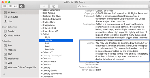
Is embedding your font still not working? Not all TrueType fonts can be embedded. Font creators can set different options for their fonts, including: Non-embeddable, Preview/Print, Editable, and Installable. To see what level of embedding your installed font is, go to the Font Book app and select the Information button at the top left. Clicking on the font shows the font information in the right-hand panel, and for many (but not all) fonts you’ll be able to locate information on whether the font can be embedded.
Is your file size too large after embedding fonts? Certain fonts can be very large compared to others, so if file size is a concern, consider using alternative fonts. If you want to remove the embedding, you can turn off the Embed setting in the Preferences dialog box (described in the procedure above) and save the file. Then, once you close and re-open the file, a different font is substituted for the font that had been embedded previously.
Requirements for embedded fonts
 |
|---|
| |
|---|


