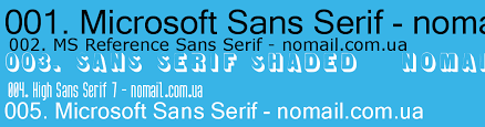
Microsoft Sans Serif
Лицензия: Платный шрифт(Paid font)
Поддержка языков: Кирилица, латиница
- English
- Русский
- Français
- Deutsch
- Español
- Українська
- čeština
- Danish
- Greek
- Hindi
- polski
- Slovak
- Swedish
- AaBbCc
- ABC
- abc
- АаБбВв
- АБВ
- абв
- Numbers
Добавить комментрий
Категории шрифтов
Скачать
Помогите проекту
Пожалуйста поделись ссылкой с друзьями,
это очень поможет развитию этого проекта.
Я хочу помочь проекту!

Кинь денежку, или клацни баннер =)
Все права на шрифты, выложенные на сайте, принадлежат их правообладателям.
Мы не продаем шрифты и, в большинстве случаев, не знаем где их купить.
По всем вопросам приобретения и использования шрифтов в своих проектах — обращайтесь к их правообладателям.
Если вы заметите ошибку на сайте, очень вас просим сообщить на почту admin@webfonts.pro
Пожалуйста поделись ссылкой с друзьями, это очень поможет развитию этого проекта.
Предложить шрифт
Не смогли найти нужный шрифт? Предложите его нам!
Мы обязательно его добавим. Если найдем, конечно 🙂
Список стандартных шрифтов Windows
Каждый дизайнер постоянно использует в своей работе различные шрифты для отображения текстовой информации. Обычно, при выборе шрифта ему приходится принимать во внимание не только привлекательность или читабельность гарнитуры, но и множество технических параметров.
Например, большинство типографий не примут документ, сверстанный с использованием системных шрифтов. Это связано с тем, что стандартные шрифты могут несколько отличаться в разных версиях Windows.
А вот при разработке веб-страницы, напротив, следует выбирать шрифт из набора стандартных. Ниже приведена таблица присутствия базовых шрифтов в стандартной поставке разных версий Windows.
| Название шрифта | Win95 | WinNT | Win98 | Win2000 | WinMe | WinXP |
|---|---|---|---|---|---|---|
| Abadi MT Condensed Light | ° | ° | + | ° | ° | ° |
| Arial | + | + | + | + | + | + |
| Arial Alternative Regular | ° | ° | ° | ° | + | ° |
| Arial Alternative Symbol | ° | ° | ° | ° | + | ° |
| Arial Black | ° | ° | + | + | + | + |
| Arial Bold | + | + | + | + | + | + |
| Arial Bold Italic | + | + | + | + | + | + |
| Arial Italic | + | + | + | + | + | + |
| Book Antiqua | ° | ° | + | ° | ° | ° |
| Calisto MT | + | |||||
| Century Gothic | ° | ° | + | ° | ° | ° |
| Century Gothic Bold | ° | ° | + | ° | ° | ° |
| Century Gothic Bold Italic | ° | ° | + | ° | ° | ° |
| Century Gothic Italic | ° | ° | + | ° | ° | ° |
| Comic Sans MS | ° | ° | + | + | + | ° |
| Comic Sans MS Bold | ° | ° | + | + | + | + |
| Copperplate Gothic Bold | ° | ° | + | ° | ° | ° |
| Copperplate Gothic Light | ° | ° | + | ° | ° | ° |
| Courier | + | + | + | + | + | + |
| Courier New | + | + | + | + | + | + |
| Courier New Bold | + | + | + | + | + | + |
| Courier New Bold Italic | + | + | + | + | + | + |
| Courier New Italic | + | + | + | + | + | + |
| Estrangelo Edessa | ° | ° | ° | ° | ° | + |
| Franklin Gothic Medium | ° | ° | ° | ° | ° | + |
| Franklin Gothic Medium Italic | ° | ° | ° | ° | + | ° |
| Gautami | ° | ° | ° | ° | ° | + |
| Georgia | ° | ° | ° | + | ° | + |
| Georgia Bold | ° | ° | ° | + | ° | + |
| Georgia Bold Italic | ° | ° | ° | + | ° | + |
| Georgia Italic | ° | ° | ° | + | ° | + |
| Georgia Italic Impact | ° | ° | ° | ° | ° | + |
| Impact | ° | ° | + | + | + | ° |
| Latha | ° | ° | ° | ° | ° | + |
| Lucida Console | ° | + | + | + | + | + |
| Lucida Handwriting Italic | ° | ° | + | ° | ° | ° |
| Lucida Sans Italic | ° | ° | + | ° | ° | ° |
| Lucida Sans Unicode | ° | ° | + | + | ° | + |
| Marlett | ° | ° | + | ° | + | ° |
| Matisse ITC | ° | ° | + | ° | ° | ° |
| Modern | + | + | + | + | ° | ° |
| Modern MS Sans Serif | ° | ° | ° | ° | ° | + |
| MS Sans Serif | + | + | + | + | + | + |
| MS Serif | + | + | + | + | + | ° |
| Mv Boli | ° | ° | ° | ° | ° | + |
| News Gothic MT | ° | ° | + | ° | ° | ° |
| News Gothic MT Bold | ° | ° | + | ° | ° | ° |
| News Gothic MT Italic | ° | ° | + | ° | ° | ° |
| OCR A E+tended | ° | ° | + | ° | ° | ° |
| Palatino Linotype | ° | ° | ° | + | ° | + |
| Palatino Linotype Bold | ° | ° | ° | + | ° | + |
| Palatino Linotype Bold Italic | ° | ° | + | ° | + | ° |
| Palatino Linotype Italic | ° | ° | ° | + | ° | + |
| Roman | ° | + | ° | + | ° | + |
| Script | ° | + | ° | + | ° | + |
| Small Fonts | ° | + | ° | + | ° | + |
| Smallfonts | + | ° | + | ° | + | ° |
| Symbol | + | + | + | + | + | + |
| Tahoma | ° | ° | + | + | + | + |
| Tahoma Bold | ° | ° | + | + | + | + |
| Tempus Sans ITC | ° | ° | + | + | ° | ° |
| Times New Roman | + | + | + | + | + | + |
| Times New Roman Bold | + | + | + | + | + | + |
| Times New Roman Bold Italic | + | + | + | + | + | + |
| Times New Roman Italic | + | + | + | + | + | + |
| Trebuchet | ° | ° | ° | ° | + | ° |
| Trebuchet Bold | ° | ° | ° | ° | + | ° |
| Trebuchet Bold Italic | ° | ° | ° | ° | + | ° |
| Trebuchet Italic | ° | ° | ° | ° | + | ° |
| Trebuchet MS | ° | ° | ° | + | ° | + |
| Trebuchet MS Bold | ° | ° | ° | + | ° | + |
| Trebuchet MS Bold Italic | ° | ° | ° | + | ° | + |
| Trebuchet MS Italic | ° | ° | ° | + | ° | + |
| Tunga | ° | ° | ° | ° | ° | + |
| Verdana | ° | ° | + | + | + | + |
| Verdana Bold | ° | ° | + | + | + | + |
| Verdana Bold Italic | ° | ° | + | + | + | + |
| Verdana Italic | ° | ° | + | + | + | + |
| Webdings | ° | ° | + | + | + | + |
| Westminster | ° | ° | + | ° | + | + |
| Wingdings | + | + | ° | + | ° | + |
| WST_Czech | ° | ° | ° | ° | ° | + |
| WST_Engl | ° | ° | ° | ° | ° | + |
| WST_Fren | ° | ° | ° | ° | ° | + |
| WST_Germ | ° | ° | ° | ° | ° | + |
| WST_Ital | ° | ° | ° | ° | ° | + |
| WST_Span | ° | ° | ° | ° | ° | + |
| WST_Swedм | ° | ° | ° | ° | ° | + |
Следует учитывать, что наличие в системе любого шрифта зависит от выбранных при установке операционной системы опций, а так же используемого программного обеспечения.
Существует несколько шрифтов, которые входят в поставку любой версии Windows. Эти шрифты являются самыми безопасными для веб-дизайна и создания электронных документов, которые должны отображаться одинаково на разных компьютерах.
Безопасные шрифты: Arial, Courier, Courier New, MS Sans Serif, MS Serif, Symbol, Times New Roman.
Существуют шрифты, которые не входят в поставку Windows ранних версий, однако почти обязательно присутствуют в системе (устанавливаются с дополнительным программным обеспечением, например, Microsoft Office). Безопасные шрифты: Arial, Courier, Courier New, MS Sans Serif, MS Serif, Symbol, Times New Roman.
Fonts
This design guide was created for Windows 7 and has not been updated for newer versions of Windows. Much of the guidance still applies in principle, but the presentation and examples do not reflect our current design guidance.
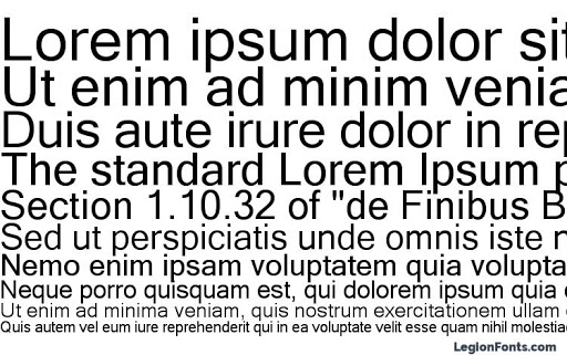
Users interact with text more than with any other element in Microsoft Windows. Segoe UI (pronounced «SEE-go») is the Windows system font. The standard font size has been increased to 9 point.

The Segoe UI font.
Segoe UI and Segoe are not the same font. Segoe UI is the Windows font intended for user interface text strings. Segoe is a branding font used by Microsoft and partners to produce material for print and advertising.
Segoe UI is an approachable, open, and friendly typeface, and as a result has better readability than Tahoma, Microsoft Sans Serif, and Arial. It has the characteristics of a humanist sans serif: the varying widths of its capitals (narrow E and S, for instance, compared with Helvetica, where the widths are more alike, fairly wide); the stress and letterforms of its lowercase; and its true italic (rather than an «oblique» or slanted roman, like many industrial-looking sans serifs). The typeface is meant to give the same visual effect on screen and in print. It was designed to be a humanist sans serif with no strong character or distracting quirkiness.
Segoe UI is optimized for ClearType, which is on by default in Windows. With ClearType enabled, Segoe UI is an elegant, readable font. Without ClearType enabled, Segoe UI is only marginally acceptable. This factor determines when you should use Segoe UI.
Segoe UI includes Latin, Greek, Cyrillic, and Arabic characters. There are new fonts, also optimized for ClearType, created for other character sets and uses. These include Meiryo for Japanese, Malgun Gothic for Korean, Microsoft JhengHei for Chinese (Traditional), Microsoft YaHei for Chinese (Simplified), Gisha for Hebrew, and Leelawadee for Thai, and the ClearType Collection fonts designed for document use.
Meiryo includes Latin characters based on Verdana. Malgun Gothic, Microsoft JhengHei, and Microsoft YaHei use a customized Segoe UI. Use of italic versions of these fonts is not recommended. Malgun Gothic, Microsoft JhengHei, and Microsoft YaHei are supplied in regular and bold styles only, meaning italic characters are synthesized by slanting the upright styles. Although Meiryo includes true italic and bold italics, these styles only apply to the Latin characters the Japanese characters remain upright when italic styling is applied.
A variation of Meiryo, called Meiryo UI, is preferred in the ribbons command user interface.
To support locales using these character sets, Segoe UI is replaced with the correct fonts depending on each locale during the localization process.
To license Segoe UI and other Microsoft fonts for distribution with a Windows-based program, contact Monotype.
Note: Guidelines related to style and tone and user interface text are presented in separate articles.
Design concepts
Fonts, typefaces, point sizes, and attributes
In traditional typography, a font describes a combination of a typeface, a point size, and attributes. A typeface is the look of the font. Segoe UI, Tahoma, Verdana, and Arial are all typefaces. Point size refers to the size of the font, measured from the top of the ascenders to the bottom of the descenders, minus the internal spacing (called leading). A point is roughly 1/72 inch. Finally, a font can have attributes of bold or italic.
Informally, people often use font in place of typeface as done in this article but technically, Segoe UI is a typeface, not a font. Each combination of attributes is a unique font (for example, 9 point Segoe UI regular, 10 point Segoe UI bold, and so on).
Serif and sans serif
Typefaces are either serif or sans serif. Serif refers to small turns that often finish the strokes of letters in a font. A sans serif typeface doesn’t have serifs.
Readers generally prefer serif fonts used as body text within a document. The serifs provide a feeling of formality and elegance to a document. For UI text, the need for a clean appearance and the lower resolution of computer monitors makes sans serif typefaces the better choice.
Contrast
Text is easiest to read when there is a large difference between the luminance of the text and the background. Black text on a white background gives the highest contrast dark text on a very light background can provide high contrast as well. This combination is best for primary UI surfaces.
Light text on a dark background offers good contrast, but not as good as dark text on a light background. This combination works well for secondary UI surfaces, such as Explorer task panes, that you want to de-emphasize relative to the primary UI surfaces.
If you want to make sure users read your text, use dark text on a light background.
Affordances
Text can use the following affordances to indicate how it is used:
- Pointer. The I-bar («text select») pointer indicates that the text is selectable, whereas the left-pointing arrow («normal select») pointer indicates that text isn’t.
- Caret. When text has input focus, the caret is the flashing vertical bar that indicates the insertion/selection point in selectable or editable text.
- Box. A box around text that indicates that it’s editable. To reduce the weight of the presentation, the box may be displayed dynamically only when the editable text is selected.
- Foreground color. Light gray indicates that text is disabled. Non-gray colors, especially blue and purple, indicate that text is a link.
- Background color. A light gray background weakly suggests that text is read-only, but in practice read-only text can have any color background.
These affordances are combined for the following meanings:
- Editable. Text displayed in a box, with a text select pointer, a caret (on input focus), and usually on a white background.
- Read-only, selectable. Text with a select pointer and a caret (on input focus).
- Read-only, non-selectable. Text with an arrow pointer.
- Disabled. Light gray text with an arrow pointer, sometimes on a gray background.
Read-only text traditionally has a gray background, but a gray background isn’t necessary. In fact, a gray background can be undesirable, especially for large blocks of text, because it suggests that the text is disabled and discourages reading.
Accessibility and the system font, sizes, and colors
The guidelines for making text accessible to users with disabilities or impairments can be boiled down to one simple rule: Respect the user’s settings by always using the system font, sizes, and colors.
If you do only one thing.
Respect the user’s settings by always using the system font, sizes, and colors.
Developers: From code, you can determine the system font properties (including its size) using the GetThemeFont API function. You can determine the system colors using the GetThemeSysColor API function.
Because you can’t make any assumptions about users’ system theme settings, you should:
- Always base your font colors and backgrounds off system theme colors. Never make your own colors based on fixed RGB (red, green, blue) values.
- Always match system text colors with their corresponding background colors. For example, if you choose COLOR_STATICTEXT for the text color, you must also choose COLOR_STATIC for the background color.
- Always create new fonts based on proportional-sized variations of the system font. Given the system font metrics, you can create bold, italic, larger, and smaller variations.
A simple way to ensure that your program respects users’ settings is to test using a different font size and a high contrast color scheme. All text should resize and display correctly in the chosen color scheme.


