- Creating icons from JPG or PNG images
- How to create an icon from an image?
- Overview
- Converting images to icons in RealWorld Icon Editor
- The source image
- Images without alpha channel
- Images with artifacts
- Fixing an unsuitable source image
- Advanced features
- Applying effects during conversion
- Optimizing pre-XP icons
- Summary
- Recent comments
- How To: Create an Icon or Other Image
- Icons and Cursors: Image Resources for Display Devices
- Create a device image (icon or cursor)
- To create a new icon or cursor
- To add an image for a different display device
- To copy a device image
- To delete a device image
- To create transparent or inverse regions in device images
- To create transparent or inverse regions
- To change the screen or inverse color
- Use the 256-color palette
- To create a 256-color icon or cursor
- To choose a color from the 256-color palette for large icons
- To set a cursor’s hot spot
- To create and save a bitmap as a .gif or .jpeg
- To convert an image from one format to another
- To add a new image resource to an unmanaged C++ project
- To add a new image resource to a project in a .NET programming language
Creating icons from JPG or PNG images
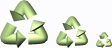
 |
 |  |
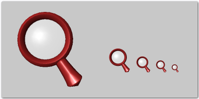
| Good (large, square, no borders) image for image to icon conversion. | Bad image for icon conversion: it is small, has redundant empty borders, its edges are blended with background. |
| Icon created from the left image. A shadow effect was used to enhance object’s outline. | Icon from the right image is smaller than necessary, has wrong proportions, and an unwanted cyan outline. |
Images with artifacts
If a source image is stored using a lossy image format such as JPG, it contains artifacts. Images with artifacts are not suitable, because background and foreground are mixed and the application is unable to separate them. This is similar to the problem with smooth edges.
Fixing an unsuitable source image
A raster image editor integrated in RealWorld Icon Editor can help you fix most problems with source images and prepare them for conversion to icon.
To edit an opened image, click ‘Edit as Raster Image’ command in ‘Document’ menu or on toolbar. The application window is now showing the image in edit mode. Enable alpha channel in ‘Document’->’Raster Image Properties’ dialog and use the Flood Fill tool to remove background manually (replace it with transparent color). Experiment with the tolerance parameter of the Flood Fill tool to remove image artifacts and/or antialiased outline.
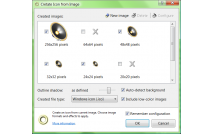
Once the background is fixed, switch to the ‘Image Viewer’ layout. Activate the ‘Remove Borders’ operation in ‘Document’ menu to automatically remove empty borders and center image in the smallest square possible. The image is now ready and you may use it to create a new icon by clicking one of the ‘Create Icon’ commands.
Advanced features
RealWorld Icon Editor offers two unique features related to image to icon conversion.
Applying effects during conversion
Almost all Windows XP icons have some kind of shadow or outline enhancement effect. These effects, when used appropriately, give icons uniform style and improve the recognition speed by emphasizing important features of an image. It is of course possible to incorporate these effects into the source image manually, but it would be a lot of work, because:
- The effect should be similar on all icons that are used together. Therefore the size of source images should either be the same or the size of the effect must be relative to the source image size.
- Different image sizes in an icon require different effects. To get perfect results you would need to apply different effects on each generated image.
 No shadow — contours are hard to recognize. | 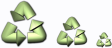 Simple shadow improves look and feel. | 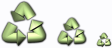 Custom shadow for each image in an icon. |
RealWorld Icon Editor can do the above automatically. It is of course customizable and you may easily change your preferences for a single icon or on a project basis.
Optimizing pre-XP icons
Prior to Windows XP, pixels in icons were either fully transparent or fully opaque. These icons had jagged edges, because smooth edges require semitransparent pixels. These images are still present in Windows XP icons and they are used when color depth of the screen is set to Hi-Color or lower or when an icon is used on older Windows. More information in article about XP icons.
RealWorld Icon Editor allows optimizing pre-XP icons for predefined background color. These icons perform well on all kinds of light backgrounds, especially on toolbars, in menus, and dialogs. The ultimate choice is of course yours. You may enable or disable optimized pre-XP icons in the configuration dialog of the image to icon transformation.
 Standard pre-XP icon. |  Pre-XP optimization improves edges. | 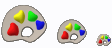 Optimized icon with shadow effect applied. |
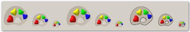
The same icons on a gray background. This is the color of Windows 2000 toolbars.
The quality of the optimized icons is getting close to Windows XP icon quality.
Summary
After reading this tutorial, you should know what is involved in an image to icon transformation, you should also know how to spot unsuitable images, how to fix them, and how to create icons in RealWorld Icon Editor.
This article covered only the basic techniques. If you cannot find certain feature or feel that something is more complicated then it should be, please leave your comment here or in the support forum. There is a good chance that a solution for your problem already exists.
Recent comments
I’m no computer nerd but surely there’s a program that converts an image to an icon? Like a MKV — MP4 converter for video?
It’s A So Good Tutorial, Thanks,  I Doesn’t Can Speak English
  , Sorry For The Ortography
Maybe a lesson in how to build an image/icon from SCRATCH using you program.
I need more info!
I want to make a simple icon (No Shadows, No Shading, 16X16 or 32X32) with a transparent back ground. Transparency is the main reason I need your program.
It is not clear to me how to use the layers and what to do with them.
After I made an image/icon with you program I tried to open the images in my browser but the images do not show a transparent background.
I have no way of testing to see is the background was transparent, why doesn’t the program have a preview that shows the transparency?
It seem every developer makes adding transparency a big mystery and a difficult thing to do when it is not.
Your on line program has a good way to add transparency but it has no preview and limited to one size.
Transparent background is the default. If you create a new icon, it will start with a transparent background. How do you test the icon in the browser? Is it the fav-icon in the address bar? If you simply open an image in a tab, most browsers will ignore the transparency and add some kind of background.
(Is it an .ico file or do you use the term icon in more general sense and use .png files?)
When i tried to use my icon it just shows like an image of earth with a swirl or something next to it. how do i fix it?
A big problem I keep having is once an image (say png) is converted to bmp it loses transparency. I have seen comments made on other forums where people are insisting that bitmap images can’t have transparency.  I know that’s false because there are icons & things like bmp start orbs that have an alpha channel. Will Real World Icon Editor or the Online Icon Creator produce bmp icons that keep their transprency? Thank you for your time.
Problem on Windows 10: I made icons, changed them on my desktop through properties. I restarted the computer and they were gone, back to a generic folder. Only on one, when I selected ‘previous version’ was the new icon available. Please HELP! What am I doing wrong?
Nice application, online help could be more helpful though.
I don’t know how to create all t does is tell me about it I need to know where to go to create.
How To: Create an Icon or Other Image
You can create a new image, bitmap, icon, cursor, or toolbar, and then use the Image Editor to customize its appearance. You can also create a new bitmap patterned after a resource template.
Icons and Cursors: Image Resources for Display Devices
Icons and cursors are graphical resources that can contain multiple images in different sizes and color schemes for different types of display devices. A cursor also has a hot spot, the location Windows uses to track its position. Both icons and cursors are created and edited using the Image Editor, as are bitmaps and other images.
When you create a new icon or cursor, the Image Editor first creates an image of a standard type. The image is initially filled with the screen (transparent) color. If the image is a cursor, the hot spot is initially the upper-left corner with coordinates 0,0 .
By default, the Image Editor supports the creation of additional images for the devices shown in the following table. You can create images for other devices by typing width, height, and color-count parameters into the Custom Image dialog box.
| Color | Width (pixels) | Height (pixels) |
|---|---|---|
| Monochrome | 16 | 16 |
| Monochrome | 32 | 32 |
| Monochrome | 48 | 48 |
| Monochrome | 64 | 64 |
| Monochrome | 96 | 96 |
| 16 | 16 | 16 |
| 16 | 32 | 32 |
| 16 | 64 | 64 |
| 16 | 48 | 48 |
| 16 | 96 | 96 |
| 256 | 16 | 16 |
| 256 | 32 | 32 |
| 256 | 48 | 48 |
| 256 | 64 | 64 |
| 256 | 96 | 96 |
Create a device image (icon or cursor)
When you create a new icon or cursor resource, the Image Editor first creates an image in a specific style (32 Г— 32, 16 colors for icons and 32 Г— 32, Monochrome for cursors). You can then add images in different sizes and styles to the initial icon or cursor and edit each additional image, as needed, for the different display devices. You can also edit an image by using a cut-and-paste operation from an existing image type or from a bitmap created in a graphics program.
When you open the icon or cursor resource in the Image Editor, the image most closely matching the current display device is opened by default.
If your project doesn’t already contain an .rc file, see Creating a New Resource Script File.
The New Image Type dialog box enables you to create a new device image of a specified type. To open the New Image dialog box, go to menu Image > New Image Type. The following properties included are Target Image Type and Custom.
The Target Image Type property lists the available image types where you select the image type you want to open:
16 x 16, 16 colors
32 x 32, 16 colors
48 x 48, 16 colors
64 x 64, 16 colors
96 x 96, 16 colors
16 x 16, 256 colors
32 x 32, 256 colors
48 x 48, 256 colors
64 x 64, 256 colors
96 x 96, 256 colors
16 x 16, Monochrome
32 x 32, Monochrome
48 x 48, Monochrome
64 x 64, Monochrome
96 x 96, Monochrome
Any existing images will not be displayed in this list.
The Custom property opens the Custom Image dialog box in which you can create a new image with a custom size and number of colors.
The Custom Image dialog box enables you to create a new image with a custom size and number of colors. The following properties included are:
| Property | Description |
|---|---|
| Width | Provides a space for you to enter the width of the custom image in pixels (1 — 512, limit of 2048). |
| Height | Provides a space for you to enter the height for the custom image in pixels (1 — 512, limit of 2048). |
| Colors | Provides a space for you to choose the number of colors for the custom image: 2, 16, or 256. |
Use the Open Image dialog box to open device images in C++ projects. It lists existing device images in the current resource (images that are part of the current resource). The following property included is:
| Property | Description |
|---|---|
| Current Images | Lists the images included in the resource. Select the image type you want to open. |
To create a new icon or cursor
In Resource View, right-click your .rc file, then choose Insert Resource. If you already have an existing image resource in your .rc file, such as a cursor, you can right-click the Cursor folder and select Insert Cursor.
In the Insert Resource dialog box, select Icon or Cursor and choose New. For icons, this action creates an icon resource with a 32 Г— 32, 16-color icon. For cursors, a 32 Г— 32, Monochrome (2-color) image is created.
If a plus sign (+) appears next to the image resource type in the Insert Resource dialog box, it means that toolbar templates are available. Select the plus sign to expand the list of templates, select a template, and choose New.
To add an image for a different display device
Go to menu Image > New Device Image, or right-click in the Image Editor pane and choose New Device Image.
Select the type of image you want to add. You can also select Custom to create an icon whose size isn’t available in the default list.
To copy a device image
Go to menu Image > Open Device Image and choose an image from the current images list. For example, choose the 32 Г— 32, 16-color version of an icon.
Copy the currently displayed icon image (Ctrl+C).
Open a different image of the icon in another Image Editor window. For example, open the 16 Г— 16, 16-color version of the icon.
Paste the icon image (Ctrl+V) from one Image Editor window to the other. If you’re pasting a larger size into a smaller size, you can use the icon handles to resize the image.
To delete a device image
While the icon image is displayed in the Image Editor, go to menu Image > Delete Device Image. When you delete the last icon image in the resource, the resource is also deleted.
When you press the Del key, the images and colors you have drawn on an icon are deleted but the icon remains and you can now redesign it. If you press Del by mistake, press Ctrl+Z to undo the action.
To create transparent or inverse regions in device images
In the Image Editor, the initial icon or cursor image has a transparent attribute. Although icon and cursor images are rectangular, many don’t appear so because parts of the image are transparent and the underlying image on the screen shows through the icon or cursor. When you drag an icon, parts of the image may appear in an inverted color. You create this effect by setting the screen color and inverse color in the Colors window.
The screen and inverse colors you apply to icons and cursors either shape and color the derived image or assign inverse regions. The colors indicate parts of the image that have those attributes. You can change the colors that represent the screen-color and inverse-color attributes in editing. These changes don’t affect the appearance of the icon or cursor in your application.
The dialog boxes and menu commands you see might differ from those described in Help depending on your active settings or edition. To change your settings, go to menu Tools > Import and Export Settings. For more information, see Personalize the Visual Studio IDE.
To create transparent or inverse regions
In the Colors window, choose the selector Screen-Color or Inverse-Color.
Apply the screen or inverse color onto your image using a drawing tool. For more information on drawing tools, see Using a Drawing Tool.
To change the screen or inverse color
Select either the Screen-Color selector or the Inverse-Color selector.
Choose a color from the Colors palette in the Colors window.
The complementary color is automatically assigned for the other selector.
If you double-click the Screen-Color or Inverse-Color selector, the Custom Color Selector dialog box appears.
Use the 256-color palette
Using the Image Editor, icons and cursors can be sized large (64 Г— 64) with a 256-color palette to choose from. After creating the resource, a device image style is selected.
To create a 256-color icon or cursor
In Resource View, right-click your .rc file, then choose Insert Resource. If you already have an existing image resource in your .rc file, such as a cursor, you can right-click the Cursor folder and select Insert Cursor.
In the Insert Resource dialog box, select Icon or Cursor and choose New.
Go to menu Image > New Device Image and select the 256-color image style you want.
To choose a color from the 256-color palette for large icons
To draw with a selection from the 256-color palette, you need to select the colors from the Colors palette in the Colors window.
Select the large icon or cursor, or create a new large icon or cursor.
Choose a color from the 256 colors displayed in the Colors palette in the Colors window.
The color selected will become the current color in the Colors palette in the Colors window.
The initial palette used for 256-color images matches the palette returned by the CreateHalftonePalette Windows API. All icons intended for the Windows shell should use this palette to prevent flicker during palette realization.
To set a cursor’s hot spot
The hot spot of a cursor is the point to which Windows refers in tracking the cursor’s position. By default, the hot spot is set to the upper-left corner of the cursor with coordinates 0,0 . The Hotspot property in the Properties window shows the hot spot coordinates.
On the Image Editor toolbar, choose the Set Hotspot tool.
Select the pixel you want to assign as the cursor’s hot spot.
The Hotspot property in the Properties window displays the new coordinates.
To create and save a bitmap as a .gif or .jpeg
When you create a bitmap, the image is created in bitmap format (.bmp). You can, however, save the image as a GIF or JPEG or in other graphic formats.
This process doesn’t apply to icons and cursors.
Go to menu File > Open, then select File.
In the New File dialog box, choose the Visual C++ folder, then select Bitmap File (.bmp) in the Templates box and select Open.
The bitmap opens in the Image Editor.
Make changes to your new bitmap as needed.
With the bitmap still open in the Image Editor, go to menu File > Save filename.bmp As.
In the Save File As dialog box, type the name you want to give the file and the extension that denotes the file format you want in the File Name box. For example, myfile.gif.
You must create or open the bitmap outside of your project in order to save it as another file format. If you create or open it within your project, the Save As command will be unavailable. For more information, see Viewing Resources in a Resource Script File Outside of a Project (Standalone).
Select Save.
To convert an image from one format to another
You can open GIF or JPEG images in the Image Editor and save them as bitmaps. Also, you can open a bitmap file and save it as a GIF or JPEG. Images you work with need not be part of a project for editing in the development environment (see stand-alone image editing).
Open the image in the Image Editor.
Go to menu File > Save filename As.
In the Save File As dialog box, in the File name box, type the file name and the extension that denotes the format you want.
Select Save.
To add a new image resource to an unmanaged C++ project
In Resource View, right-click your .rc file, then choose Insert Resource. If you already have an existing image resource in your .rc file, such as a cursor, you can simply right-click the Cursor folder and select Insert Cursor.
In the Insert Resource dialog box, select the type of image resource you’d like to create (Bitmap, for example) then choose New.
If a plus sign (+) appears next to the image resource type in the Insert Resource dialog box, it means that toolbar templates are available. Select the plus sign to expand the list of templates, select a template, and choose New.
To add a new image resource to a project in a .NET programming language
In Solution Explorer, right-click the project folder (for example, WindowsApplication1).
From the shortcut menu, select Add, then choose Add New Item.
In the Categories pane, expand the Local Project Items folder, then choose Resources.
In the Templates pane, choose the resource type you’d like to add to your project.
The resource is added to your project in Solution Explorer and the resource opens in the Image Editor. You can now use all the tools available in the Image Editor to modify your image. For more information on adding images to a managed project, see Loading a Picture at Design Time.


